Case study · Enterprise monitoring · 2021–24
Sentiments Survey
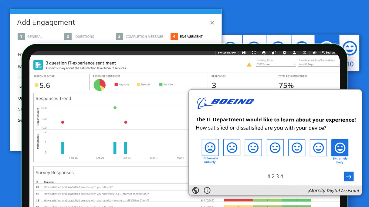
Aternity could measure how a laptop was performing. It couldn’t tell you whether the person using it was frustrated. This is the tool that asked them — and the design work was almost entirely about earning the interruption.
The problem
Every metric was green. People were still unhappy.
The question I started with: how do you ask an employee how they feel without becoming the third thing that interrupted them this morning?
Aternity knew boot times, crash counts and application latency across the whole estate. What it couldn’t see was the gap between a device performing acceptably and a person finding it acceptable — the machine that technically works and is still miserable to use.
Asking directly was the obvious answer, and the obvious risk. A survey that annoys people produces worse data than no survey, because the ones who answer are the ones who were already angry.

Laura — end user representative
Laura carries sentiment from the workforce back to IT. She’ll answer if it’s quick, if it looks like it came from her own company, and if she believes anything happens as a result. All three of those turned out to be design decisions.
The response rate isn’t a marketing problem you solve afterwards. It’s the thing the interface is for.
Decisions
What I considered, what I chose, and what made the difference
A modal that opens on deployment and waits for an answer.
A blinking icon that expires on its own after a window the administrator sets — but stays put if the user started and got interrupted.
A modal converts better and poisons the data. Someone who answered to make the box go away isn’t reporting sentiment. The expiry means ignoring it is a valid response; the persistence means abandoning it halfway isn’t held against you.
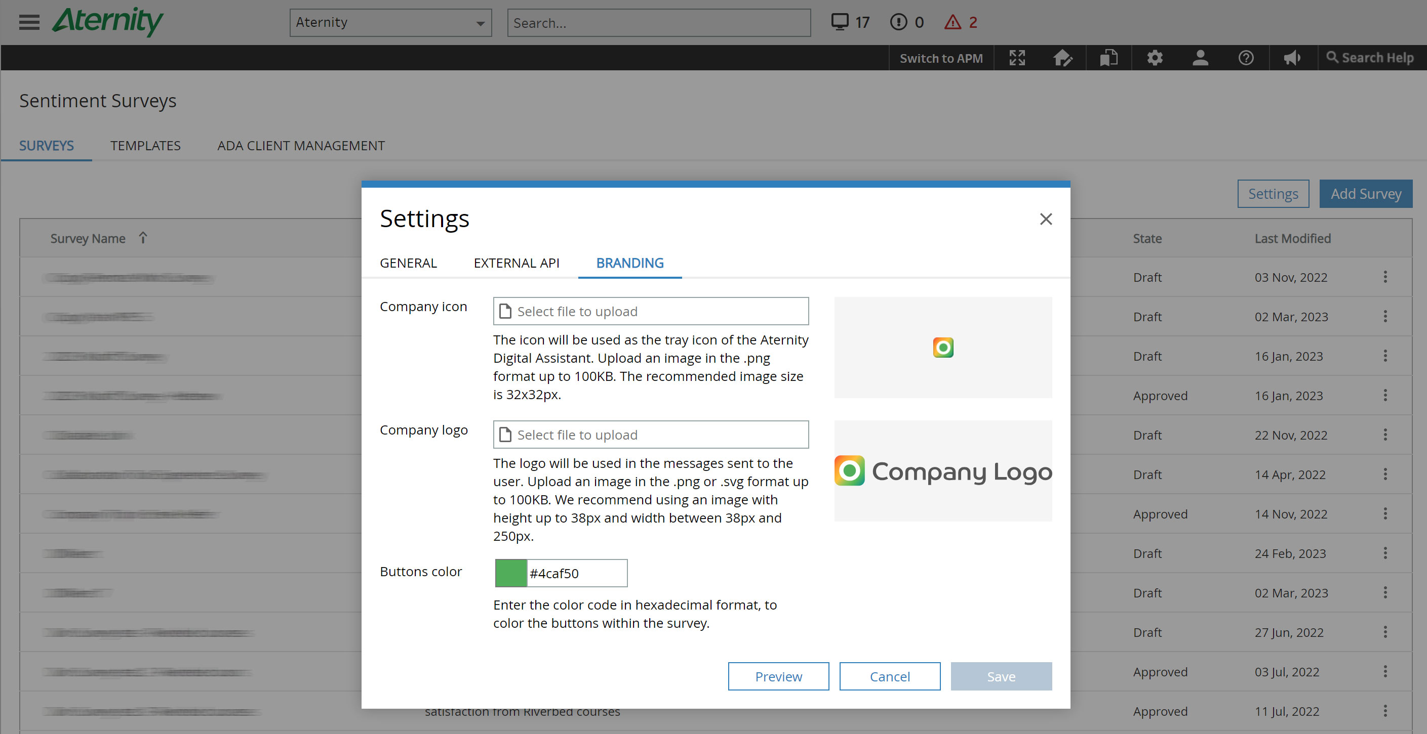
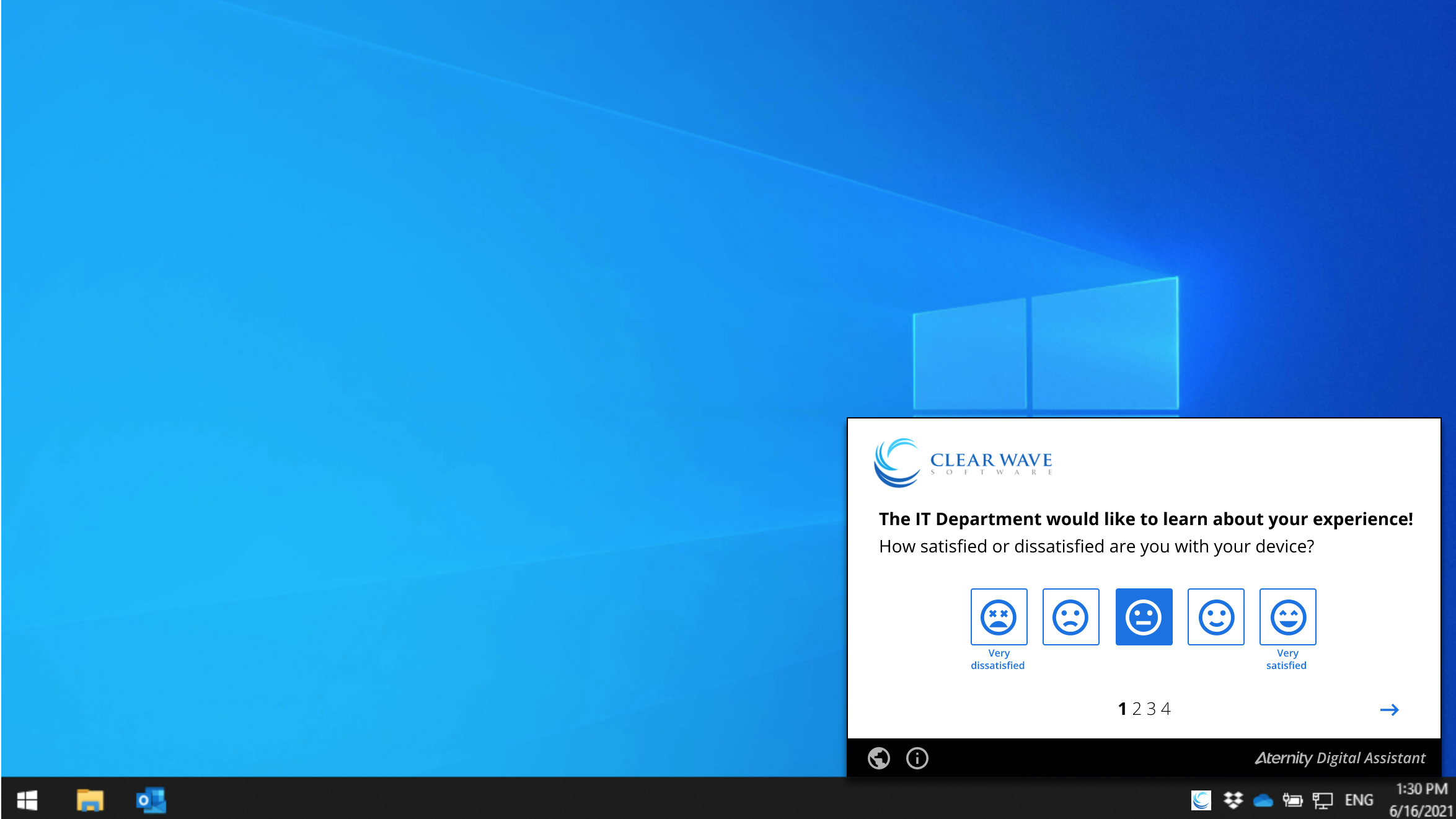
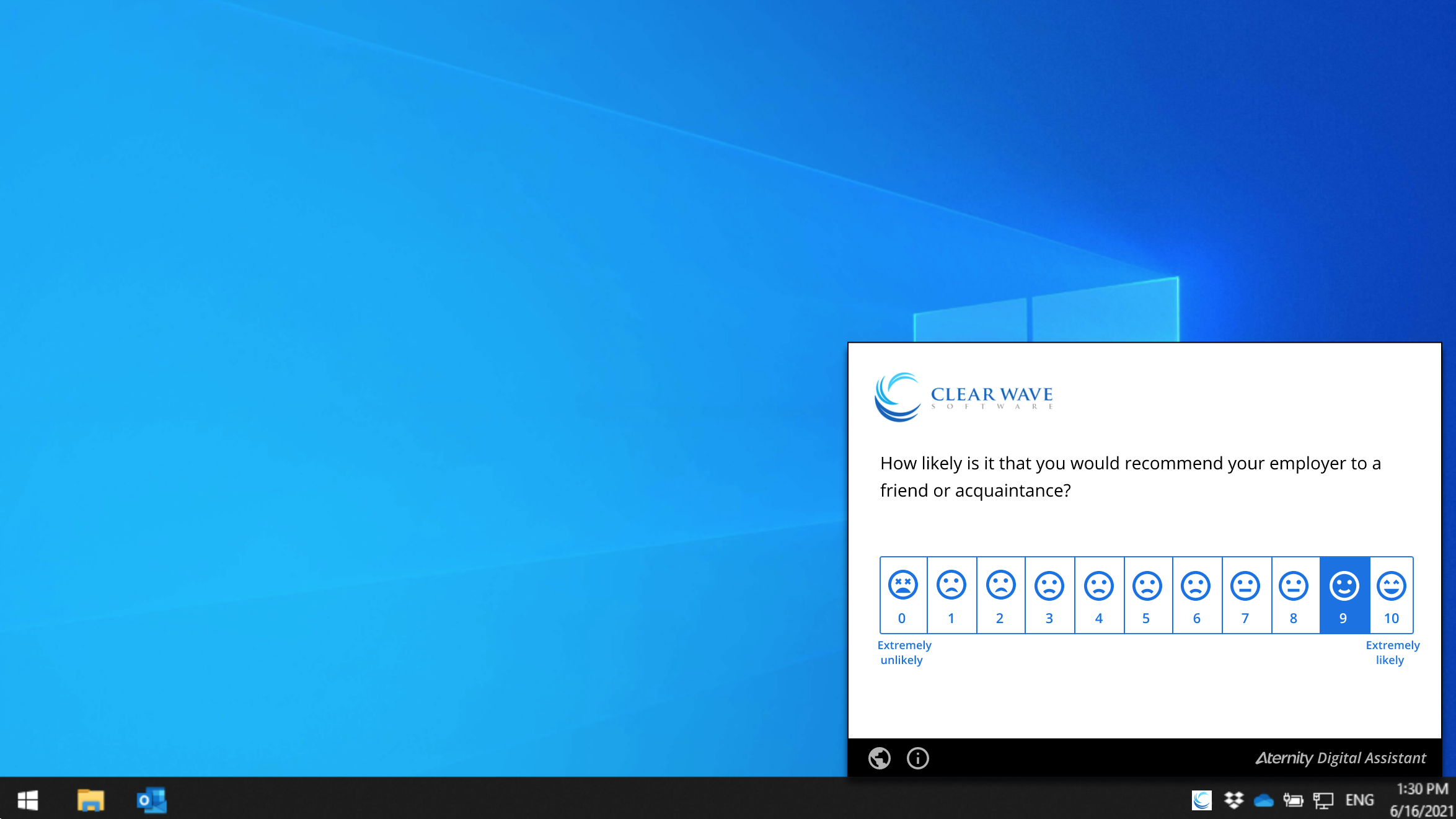
Aternity’s own branding — it’s an Aternity feature.
A single primary colour set by the admin, propagated to every element including icons, emoticons and buttons.
An unfamiliar vendor asking how you feel about your laptop reads as spam. The same question from your own IT department reads as someone doing their job. Half-branding is worse than none — a survey in company colours with vendor-blue emoticons looks assembled, not sent.
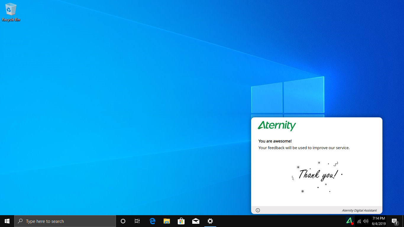
Close the window. The survey is complete, nothing more to say.
Animation, progress and a designed thank-you state — the response acknowledged rather than absorbed.
This survey runs again next quarter. Whether someone answers it the second time depends entirely on how the first one ended. A window that vanishes teaches people their answer went nowhere.
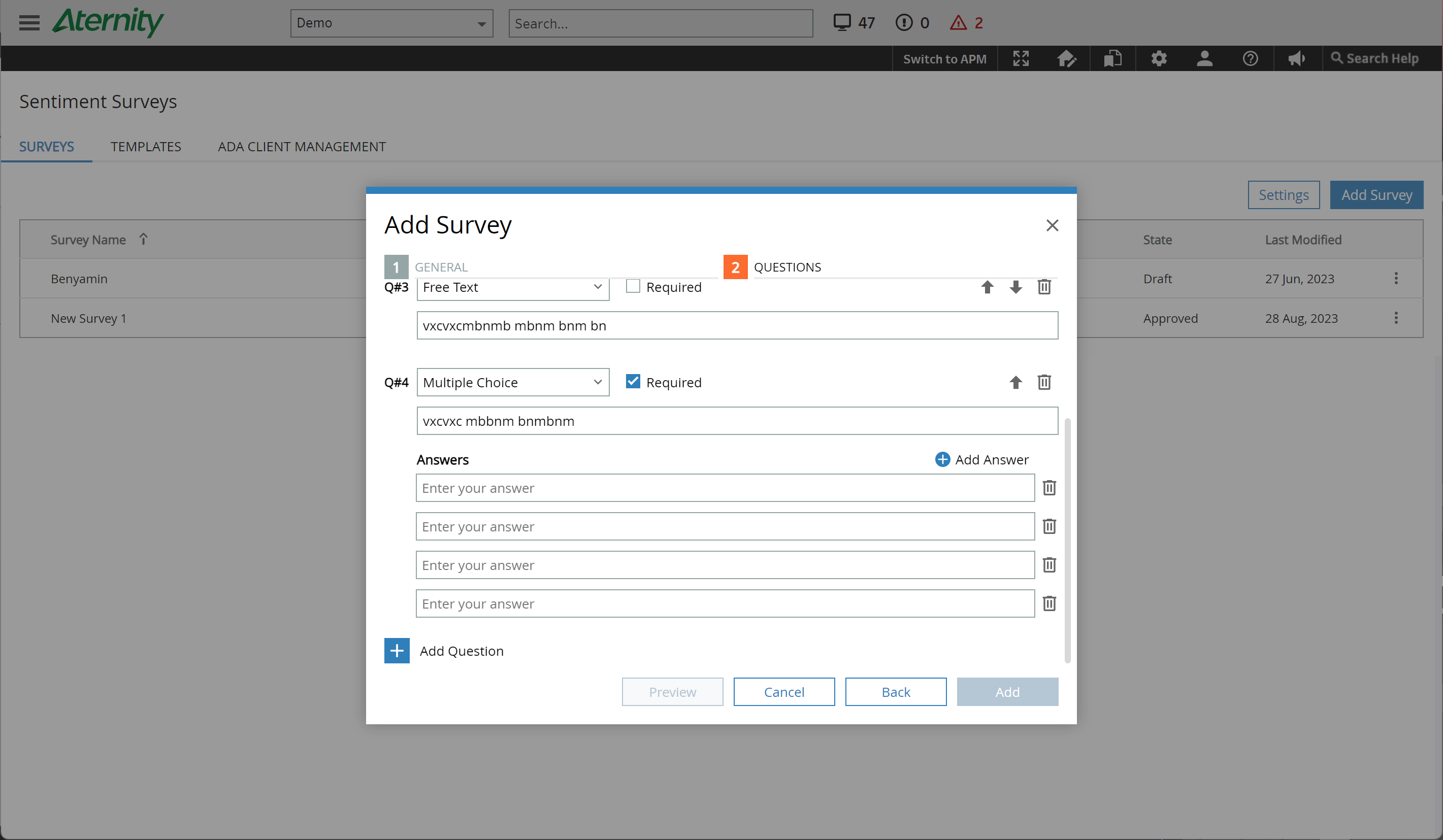
A form: type the question, pick the answer type, save, repeat.
A builder with live preview, reorderable questions, and add/remove on answer options in place.
A form makes you imagine the result. Since the whole product depends on the survey not feeling careless, the admin needs to see what the employee will see while they’re still writing it — not after they’ve deployed to four thousand people.
What shipped
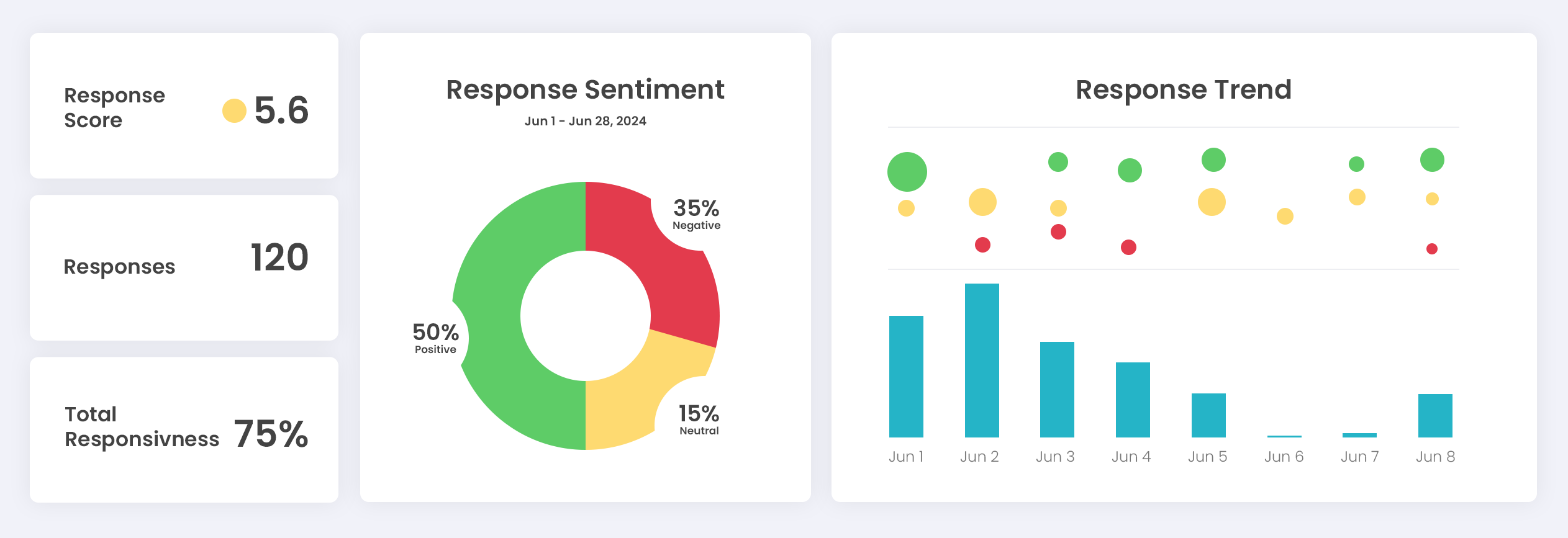
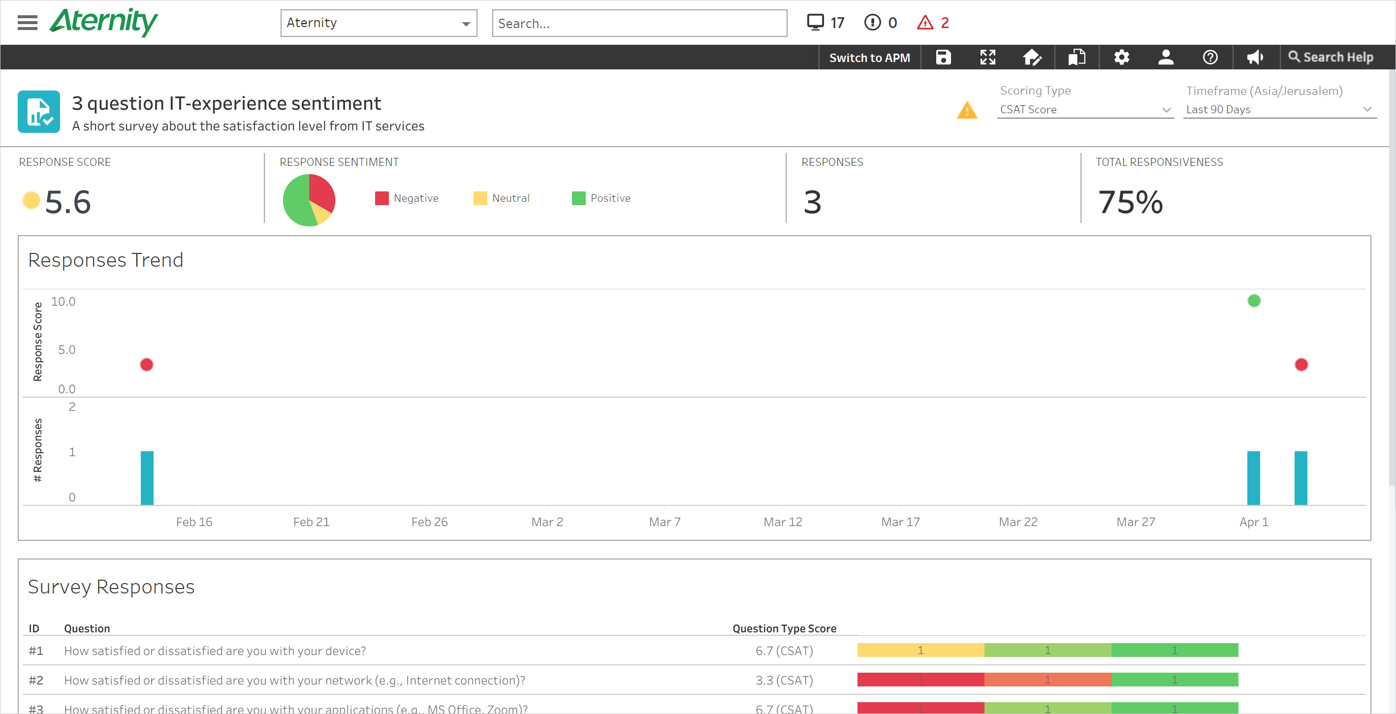
Six question formats, one notification, one dashboard
0–10, likelihood to recommend. Predicts both repurchase and referral.
Bipolar, seven steps. For nuance on a specific service.
Bipolar, five steps. The default for how something feels.
One answer from a defined list.
Open response, for what the scales missed.
Closed question, no middle ground.

Takeaways
What I took from it
Consent is a design surface
The expiring notification is the decision I’d defend hardest. Making it easy to ignore lowered response rates and raised data quality — and those aren’t the same metric, however often they’re reported as one.
Whose logo is on it changes the answer
Branding looked like a cosmetic requirement. It was actually the difference between an internal request and an unsolicited one, and it had to reach every element or it wasn’t worth doing.
The end of the flow is the start of the next one
Designing the thank-you state properly is the cheapest investment in a recurring survey. Nobody answers the second one because of how the second one looks.
Preview isn’t a convenience
When the product’s value depends on tone, the person writing it has to see what they’re sending. A builder without preview would have shipped surveys that undermined the feature.
What I’d do differently
I designed the asking and never designed the answering-back. Employees give feedback and hear nothing — no “we saw this, here’s what changed.” Next time I’d design the loop closing first, because that’s what makes the third survey worth answering.