Aternity · Enterprise monitoring · 2021–24
Diagnosing a laptop while its owner is still on the phone.
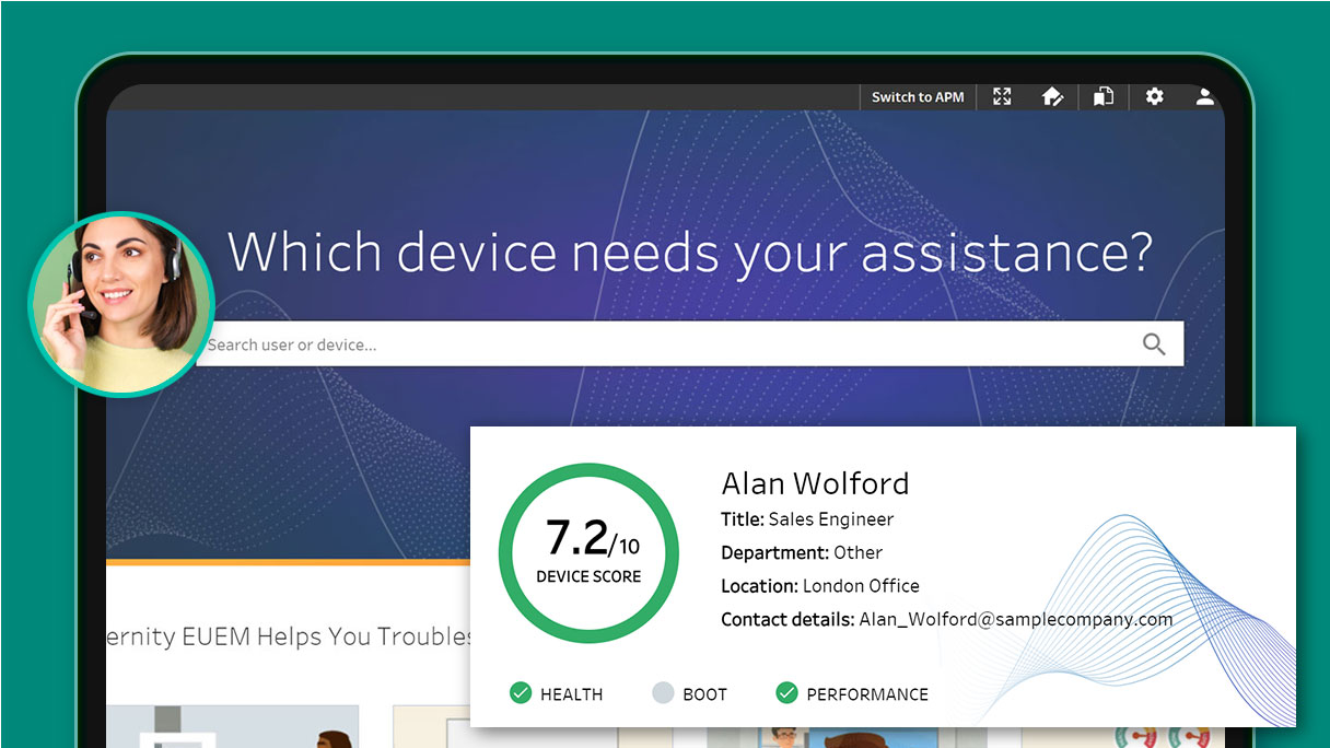
Level 1 support takes the first call. They are not the deepest technical people in the building, and they have about ninety seconds before the caller loses patience. I designed the screen that has to turn “my laptop is slow” into a specific, fixable cause — fast enough to say out loud.
Problem
The data was already there. It just wasn’t an answer.
Aternity collected deep telemetry on every managed device. Level 1 could see all of it and act on almost none of it.
Telemetry isn’t diagnosis
The existing view presented raw device metrics — memory, disk, process counts, event logs. Reading it correctly required knowing what “normal” looked like for that hardware. Level 1 doesn’t carry that reference in their head, so the screen quietly assumed an expertise its actual users didn’t have.
Escalation was the default escape
When the screen didn’t produce a conclusion, the safe move was to pass the ticket up. Every unnecessary escalation costs the user another wait and Level 2 another interruption — so the real design target wasn’t “show more data,” it was “let this person finish the call.”
The screen had to produce a sentence the technician could say to a stranger.

Who’s actually holding the phone
Mike, Level 1 Support Technician — three years in the role. Comfortable with process, not with kernel internals. Judged on resolution time and satisfaction score, both of which punish him for escalating.
He is reading the screen and talking at the same time. Anything that requires interpretation, cross-referencing, or a second browser tab is functionally invisible to him during a live call.
Constraints
What the design had to survive
Four conditions that removed most of the obvious solutions before I started drawing.
Read while talking
The primary use context is one-handed and half-attentive. Every element had to be legible in a glance, at a stable position, without hovering to reveal meaning.
Wildly unlike items, one list
The device checklist spans hardware and software — disk capacity, driver versions, agent health, policy compliance. Items with nothing in common structurally still had to be comparable at a glance.
Fixes run on someone’s live machine
Remediation isn’t a form submission. It executes a script on a laptop a real person is currently using, and it requires their approval. The interface carries responsibility for what the technician is about to set in motion.
Existing platform, existing teams
This lived inside an established product with its own component library and ServiceNow integration. Cross-team dependencies meant new patterns had to justify themselves against reuse.
Decisions
What I considered, what I chose, and what made the difference
Sort every item by severity, so the worst problem is always first.
Fixed grouping by subsystem — hardware and software — with status shown inside each group.
Severity sorting reshuffles the list on every visit, so the technician never builds muscle memory for where anything lives. A stable map is worth more than an optimal first row to someone scanning while talking — and the worst item still reads instantly through colour.
Status label plus colour — Disk: Fail — matching the platform’s existing table conventions.
Colour, icon, and a plain-language description of the actual condition on every row.
“Fail” tells you something is wrong; “no free disk space detected” tells you what to say and what to do. The description is the part that gets spoken to the caller, so it isn’t supporting text — it’s the payload. Colour alone also fails colour-blind technicians, which the icon covers.
A single scrolling page holding device details and the full checklist together.
Two tabs — Overview and Device Checklist — with the device health score pinned above both.
The first question on any call is whether this is even a device problem. The score answers it in seconds and often ends the investigation there. Forcing a scroll past forty checklist rows to reach that answer inverts the order the work actually happens in.
An inline one-click Fix on the row, keeping the technician in flow.
A Run Action dialog stating what the script does, pulling the ServiceNow ticket context, before anything executes.
One click is the right pattern when the cost of being wrong is low. Here the action runs on a machine someone is working on and needs their consent — so the technician has to be able to describe it out loud before they trigger it. The dialog exists to make that sentence available, not to slow anyone down.
The screens
The call, start to finish
Four states covering the path from an incoming call to a resolved device.
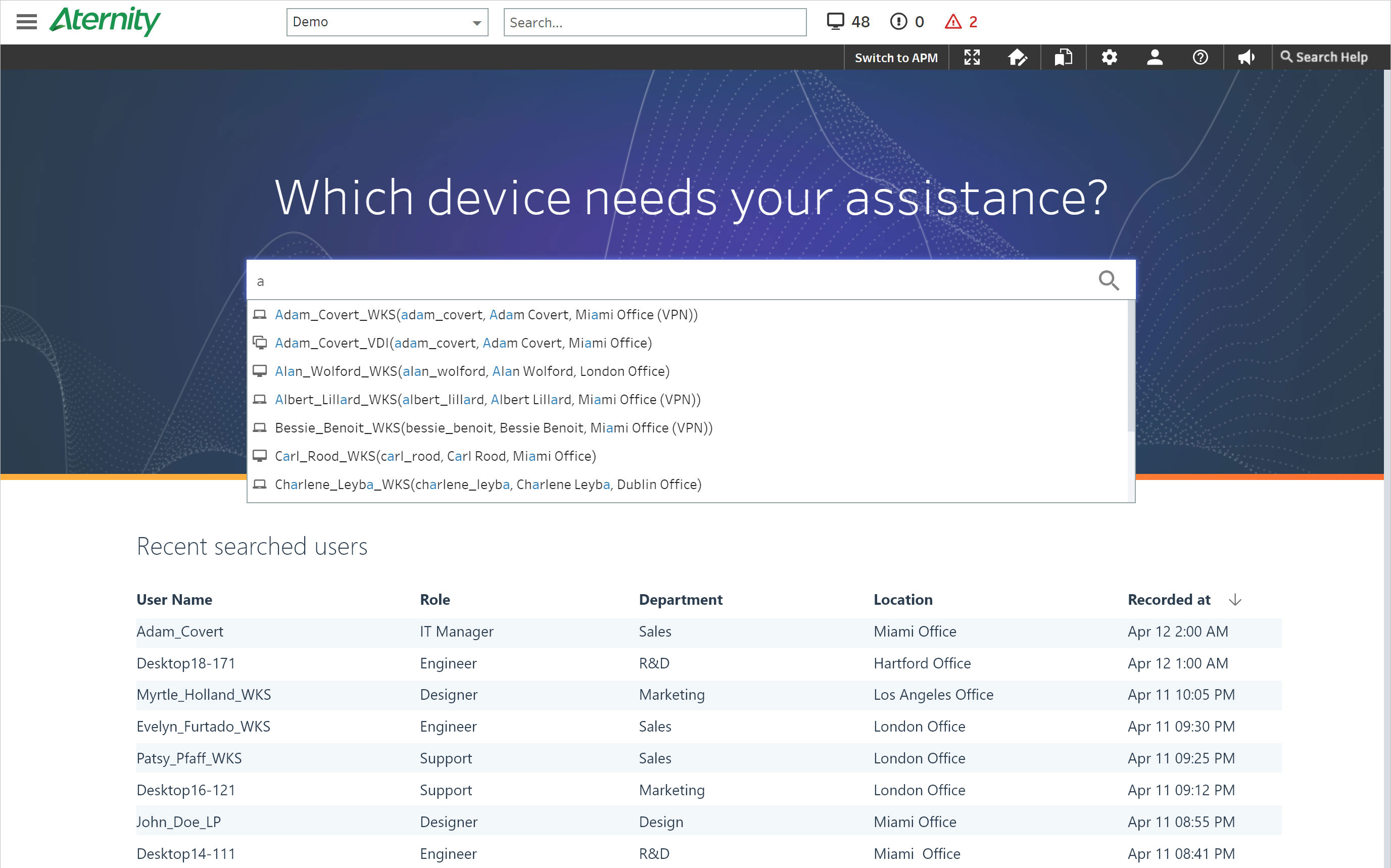
01 · Find the device
The call arrives before any context does. Search is the single dominant element on the landing screen — the technician has a name or an asset tag and nothing else, and everything downstream depends on resolving that first.
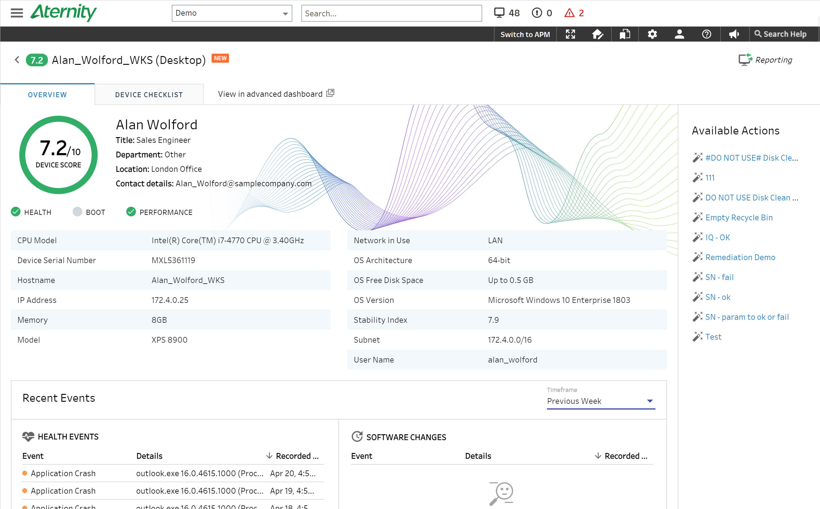
02 · Rule out the device
Overview leads with the health score, specs, and recent events. Green icons and a clean score let the technician eliminate the hardware as a cause without reading a single row — the fastest possible exit from the wrong investigation.
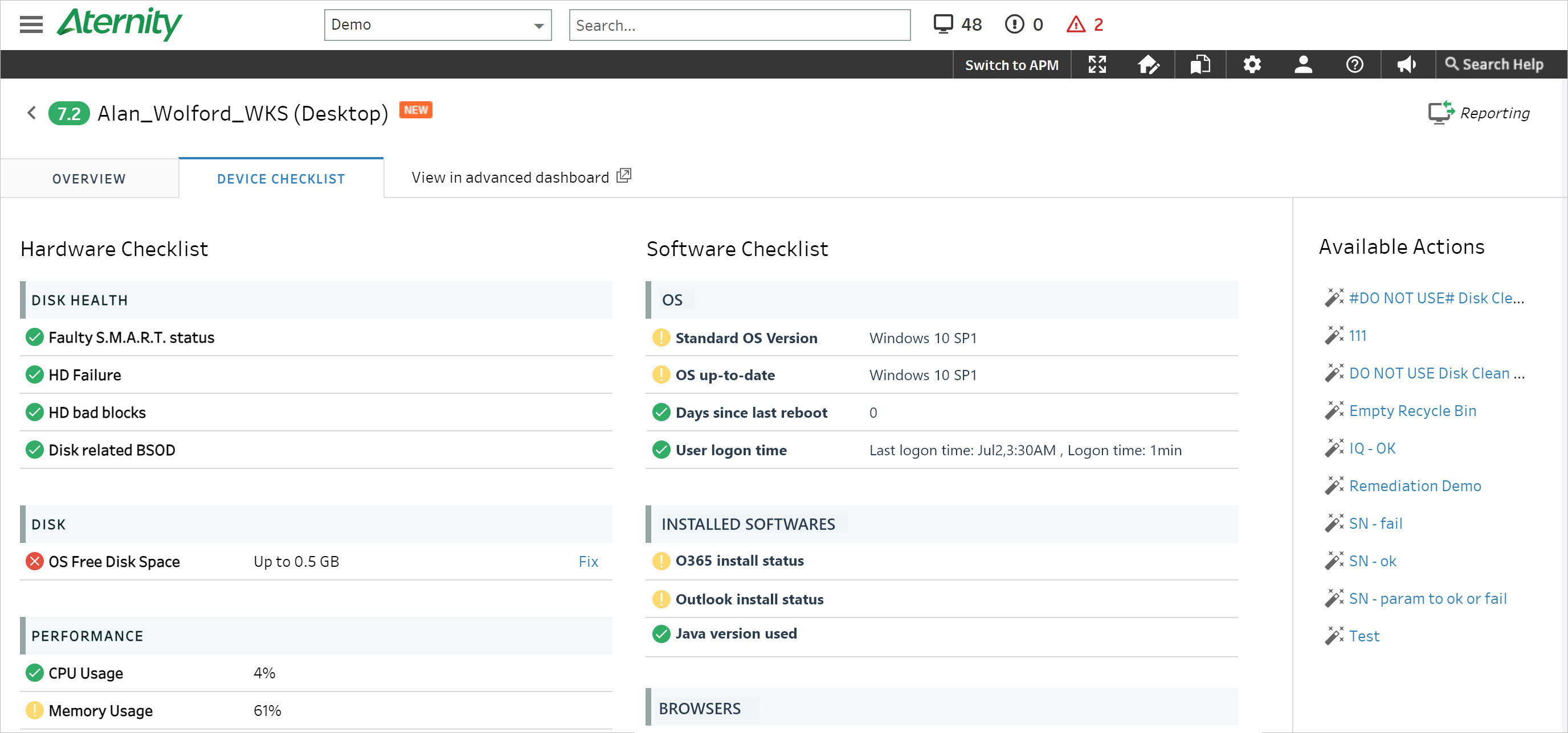
03 · Locate the cause
The checklist, grouped and described. A failing item reads as a sentence — no free disk space detected — with the remediation action attached to the row that explains it rather than parked in a separate actions menu.
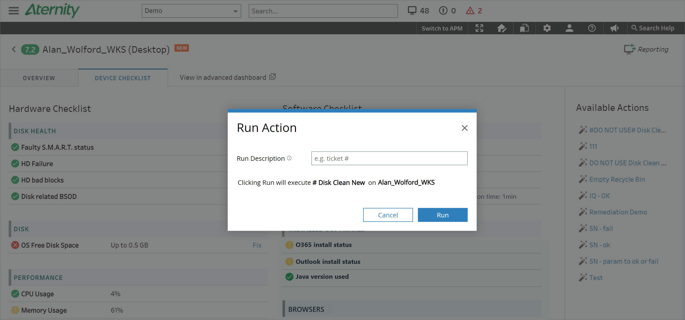
04 · Say it, then run it
Run Action names the script, surfaces the ServiceNow description, and states that the user must approve on their end. The technician reads it aloud, the caller consents, and the fix executes with both people knowing what happened.
Outcome
What changed
The same telemetry, reorganised around the moment it gets used.
Takeaways
What I took from it
Design for the second job
Mike’s visible task is reading a screen. His actual task is holding a conversation with a frustrated person while reading a screen. Optimising the first without accounting for the second produces interfaces that test well and fail live.
Stability beats optimality in scanning
Severity sorting is defensible on paper and wrong in practice for anything used repeatedly. Predictable placement compounds; a smart reshuffle resets the user’s knowledge on every visit.
Friction is sometimes the deliverable
The Run Action dialog is a deliberate extra step. It exists because a script running on someone’s live machine deserves a sentence spoken out loud first — the same principle I’d later apply to enforcement actions in identity security.
Screens shown are from the shipped Aternity Service Desk product. Some internal research detail is omitted.