Concept · Consumer mobile · 2025
Flowy
A habit and mood tracker, designed as a self-directed exercise. Six screens, one weekend, and a deliberate move away from everything my day job looks like.
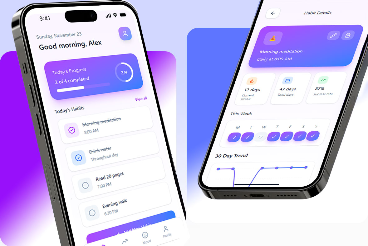
Why I made it
The opposite of a security console
The question I gave myself: what happens to my instincts when nothing on the screen is dangerous?
Most of my work is dense, high-stakes, and designed for someone under pressure. Enterprise design rewards caution — confirmations, states, defensive copy — and after enough years those reflexes fire whether the situation needs them or not.
Flowy is a consumer app where the worst outcome is a missed habit. No irreversible actions, no blast radius, no admin. Just space, rhythm and a person checking in with themselves. It was an exercise in taking the guardrails off and seeing what I’d design without them.
A minimal end-to-end journey — enough to prove the system, not a full product
The screens
Six screens, one system
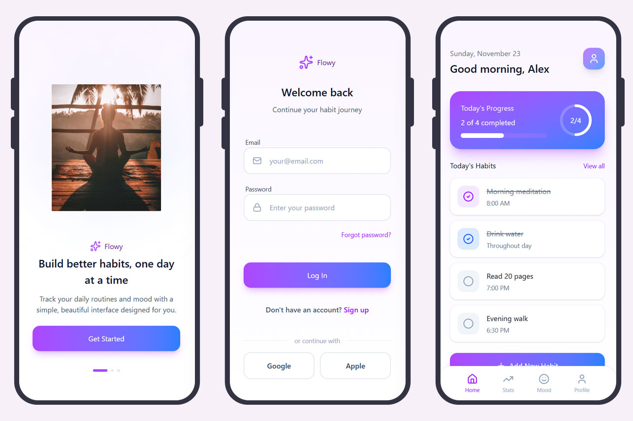
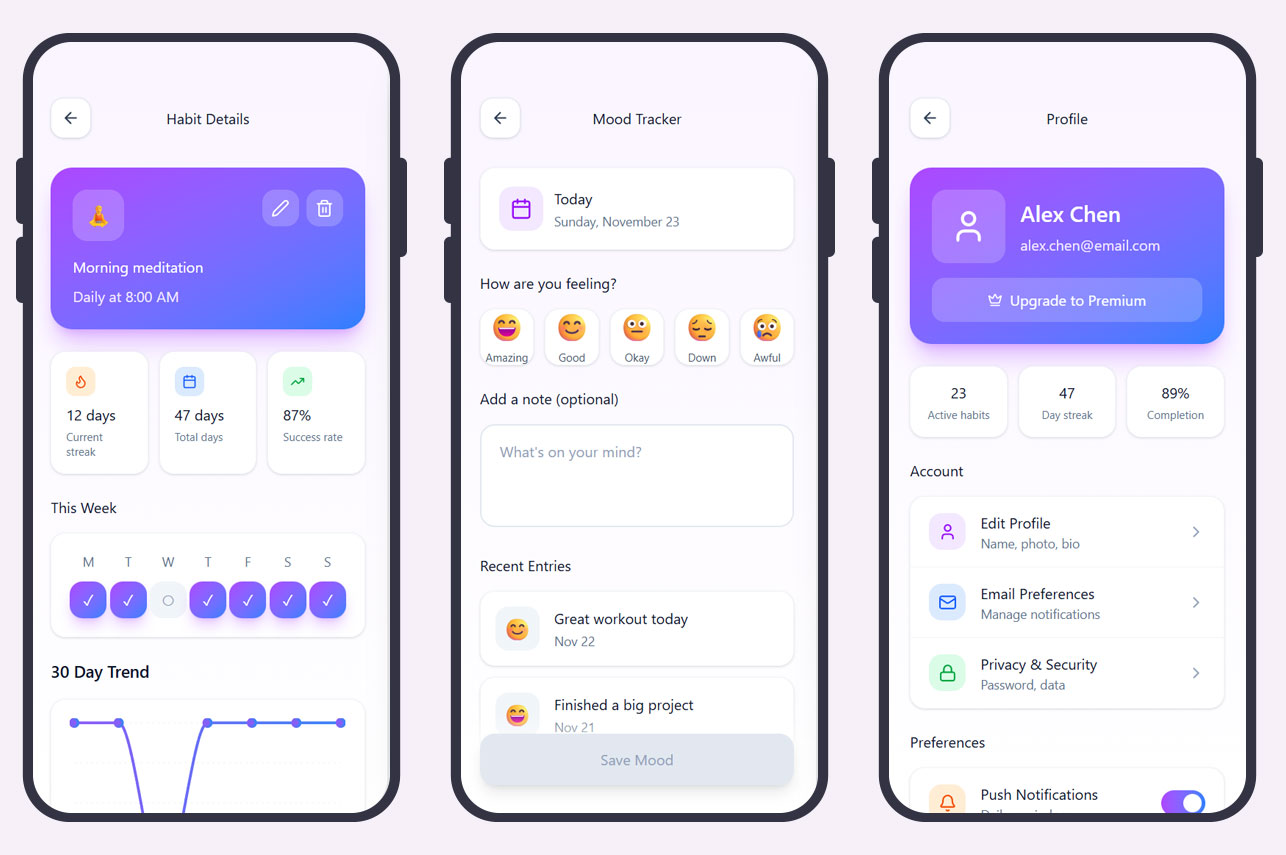
Consumer design isn’t easier. The tolerance for a wrong decision is just quieter about it.
The decision
What I considered, what I chose, and why
Streaks, charts, weekly comparison, completion percentage — the data is there, show it.
Today’s habits and one mood entry. Everything else moved behind a tap.
A habit tracker’s failure mode is guilt. A wall of statistics on open turns a missed day into a visible deficit, and people delete the app rather than face it. The restraint here is doing the same job as a confirmation dialog elsewhere — protecting someone from a bad moment.
Visual direction
Rounded shapes, soft gradients, generous spacing. Calm rather than energetic — the app is used in the morning and at the end of the day, not in the middle of a task.
Layout system
One grid, one type scale, reusable components across all six screens. Even in a concept, deciding the system first is faster than reconciling six one-offs afterwards.
Accessibility floor
High-contrast text, readable sizes, tap targets that work with a thumb. Non-negotiable regardless of how quick the exploration is.
Takeaways
What I took from it
Restraint transfers
Deciding what the dashboard doesn’t show is the same muscle as deciding what never gets a column in an enterprise table. Different stakes, identical question.
Emotional cost is a real constraint
Enterprise work trains you to think about operational risk. Consumer work made me think about how a screen makes someone feel about themselves, which is a constraint I now bring back the other way.
Systems pay off at any scale
Six screens is small enough to freehand. Building the grid and type scale first still made it faster, and it’s the reason the set holds together.
What I’d do differently
This is a visual exploration with no user in it. I designed for a person I invented. Even three conversations with people who’ve abandoned a habit app would have tested the guilt hypothesis the whole dashboard decision rests on.