Case study · Enterprise monitoring · 2021–24
Self Remediation
The platform could already see that a device was broken. Fixing it meant an admin doing the same repair by hand, one machine at a time. This is how that became a script you run on ten thousand devices — and what had to be true before anyone would press the button.
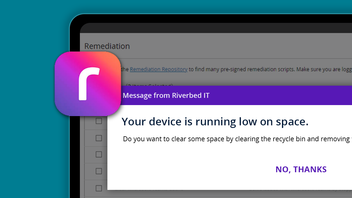
Automating device fixes cut the hours admins spent on repeat repairs.
Fewer people needed on manual device management.
Less employee downtime waiting on a fix.
Figures reported by the product team post-rollout
The problem
Seeing it was solved. Fixing it wasn’t.
The question I started with: if the platform already knows what’s wrong on 4,000 machines, why is an admin still fixing them one at a time?
Detection had been the hard problem, and it was done. What remained was the part nobody had designed: an administrator opening a remote session, running the same three commands, closing it, and doing it again. Four thousand times.
The work wasn’t difficult. It was identical, and there was no way to say “do this to all of them.” So it got triaged instead — the loudest devices got fixed and the rest waited for someone to complain.
Who I designed for
Level 3 and 4 IT administrators — the people who group devices, write scripts, and carry the consequences of running them.
- Create and monitor remediation actions
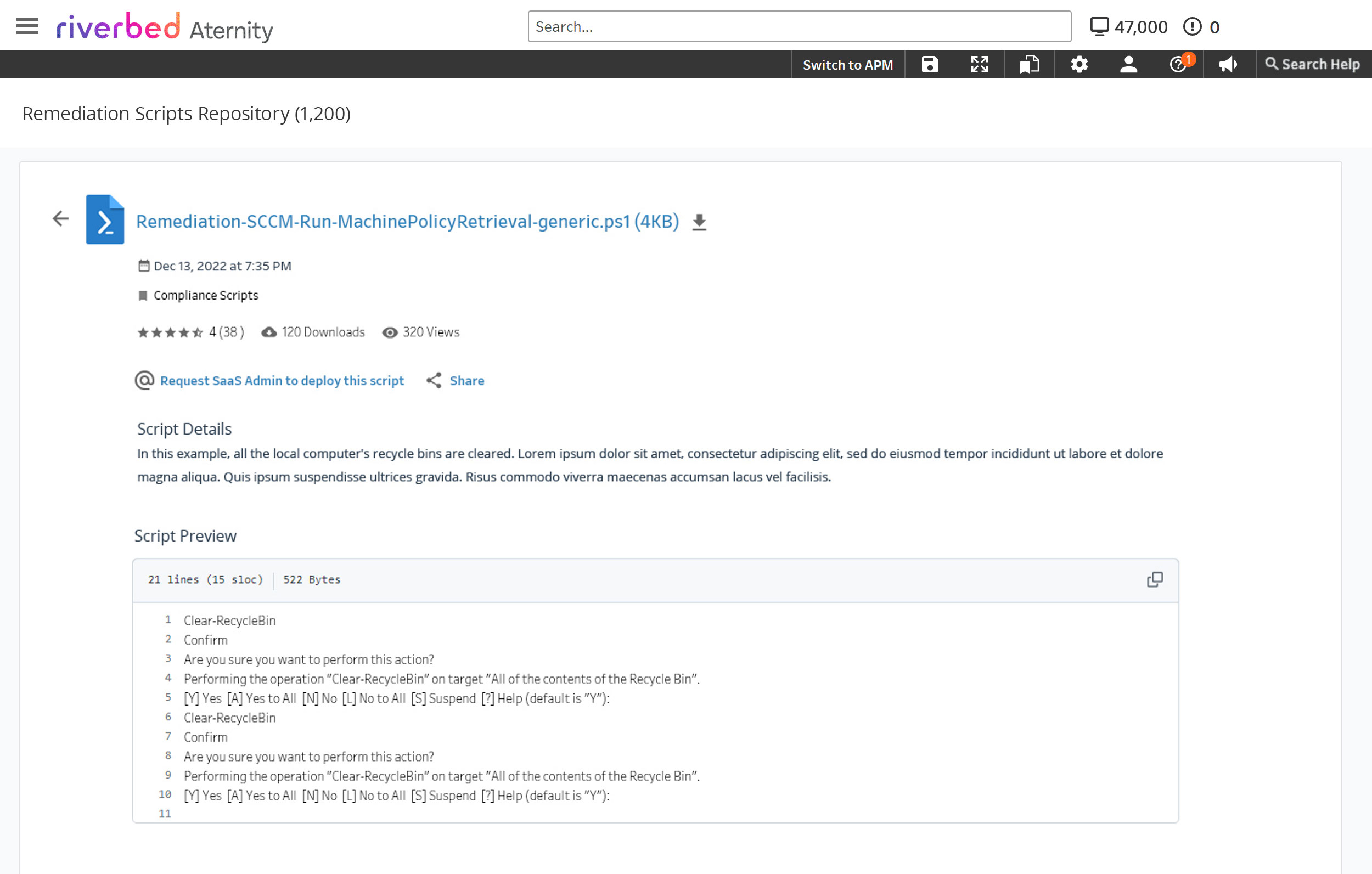
- Author and maintain scripts
- Answer for anything that breaks
And who else touches it
Support staff sit in the same screens with a narrower mandate, which turned access control into a design problem rather than a settings page.
- Can run scripts, cannot write them
- Need to see outcomes, not internals
- Every action has to be attributable
What the market assumed
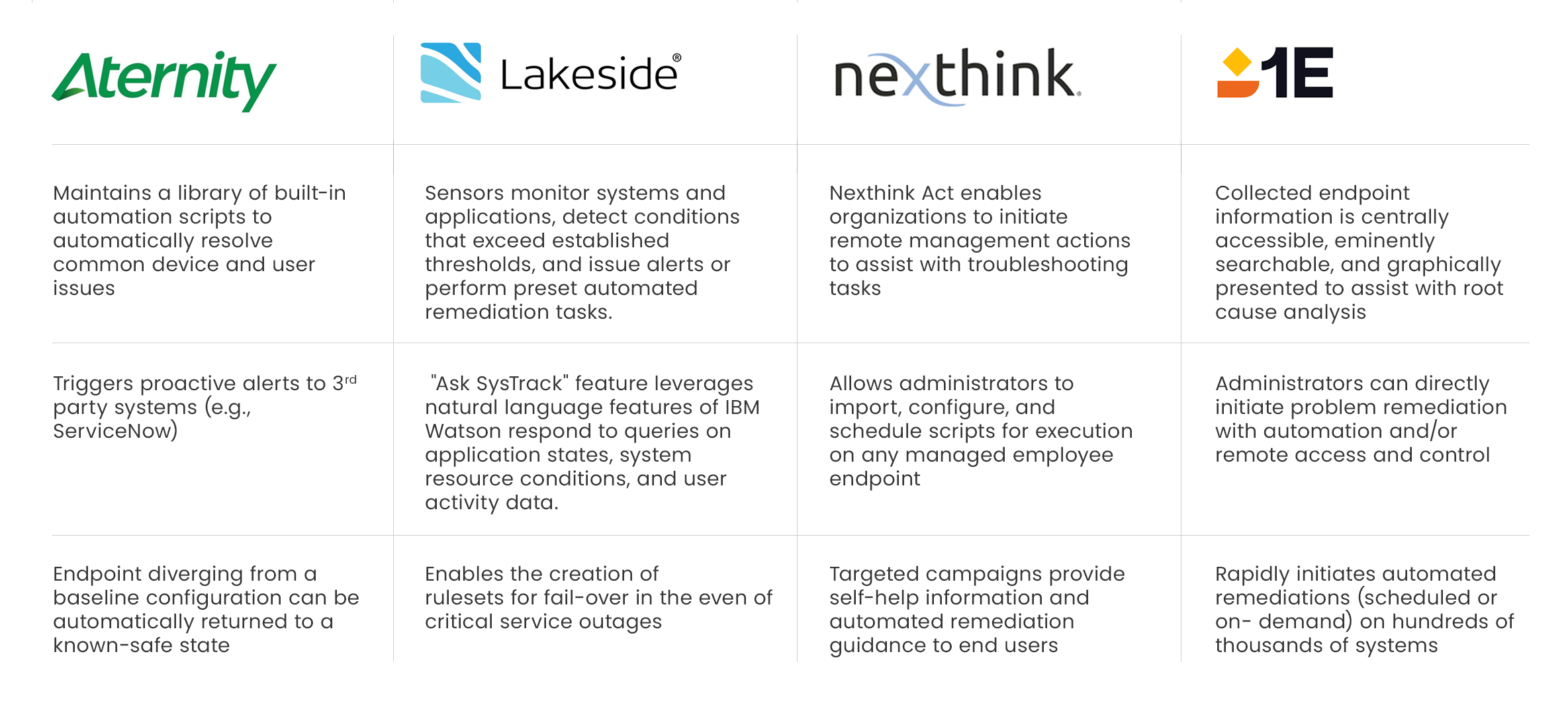
Benchmarked against Nexthink, the closest competitor on remediation and automation.
- Nexthink led on real-time automatic fixes
- Aternity’s edge was the monitoring data behind the fix
- Neither had solved bulk execution well
A one-click fix isn’t the hard part. Making someone confident enough to click it on ten thousand machines is.
Decisions
What I considered, what I chose, and what made the difference
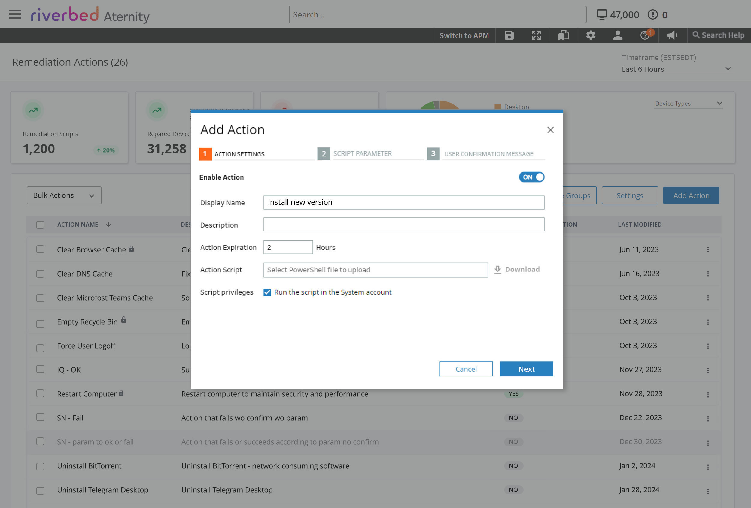
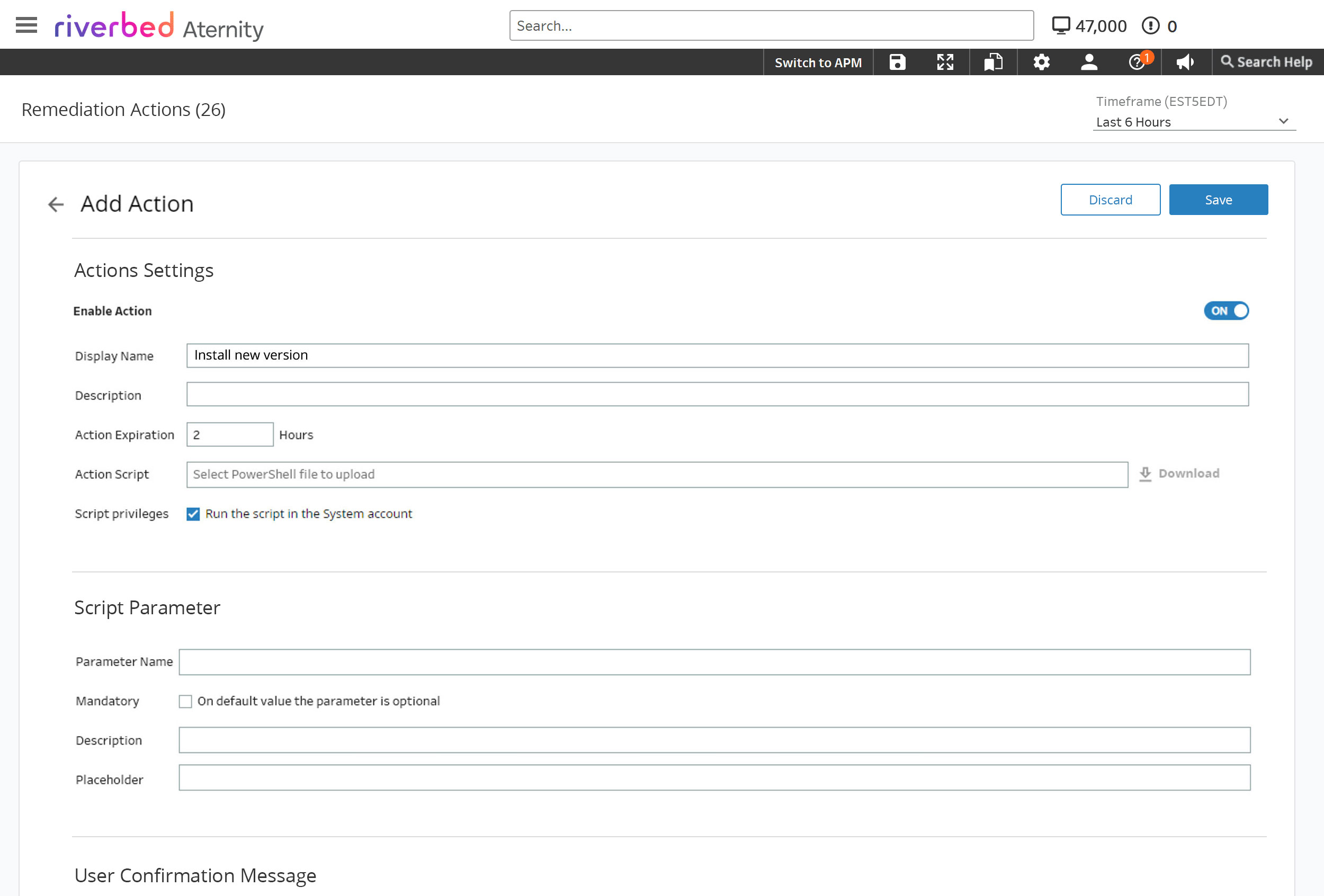
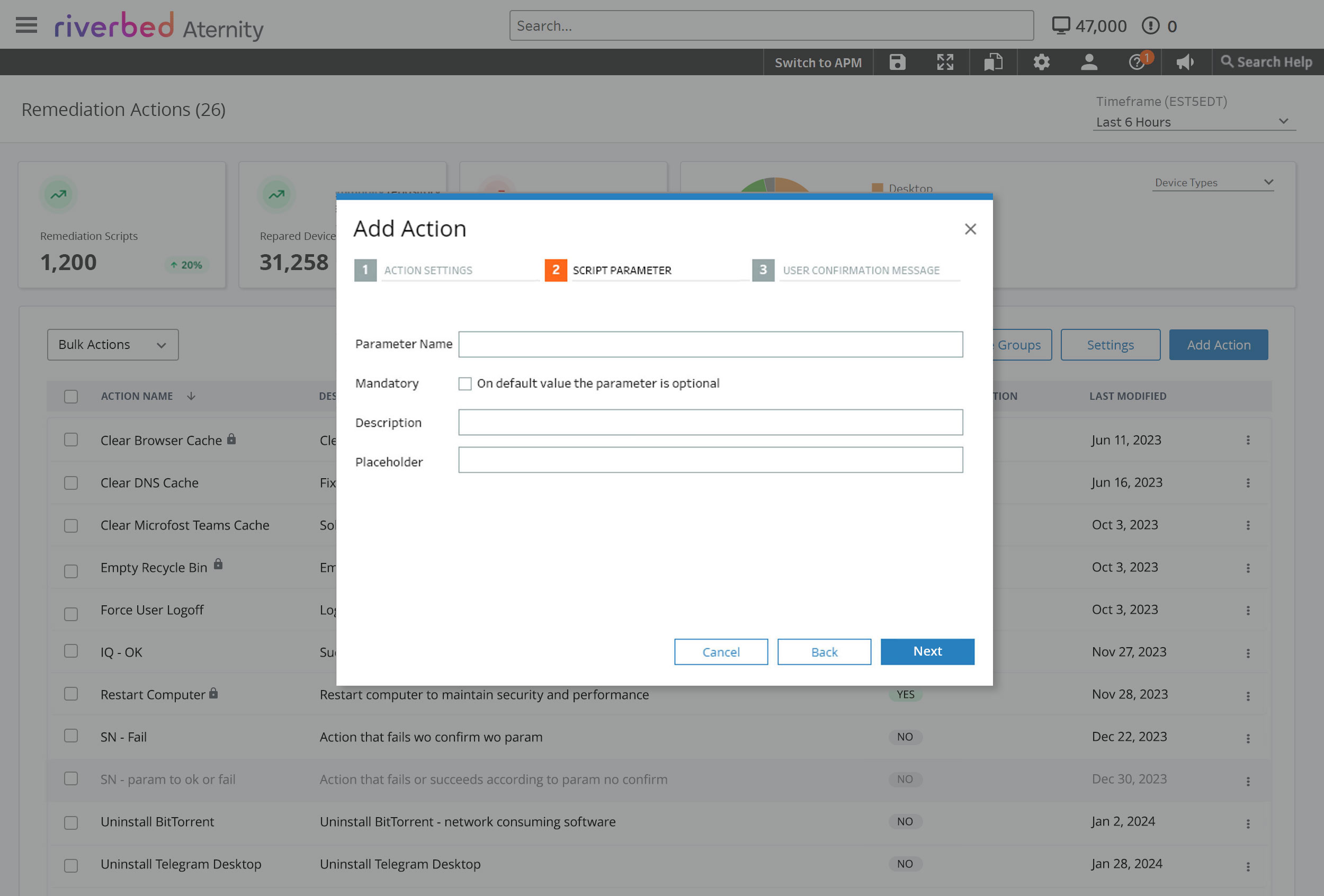
A multi-tab modal — the pattern already used everywhere else in the platform.
Move the tabs onto a full page and abandon the modal entirely.
The modal couldn’t hold the task. Validation errors blocked you from reaching the next tab, the preview alert opened on top of the thing it was previewing, and there was nowhere left to put anything. Going to a page wasn’t a style preference — the content had outgrown the container.
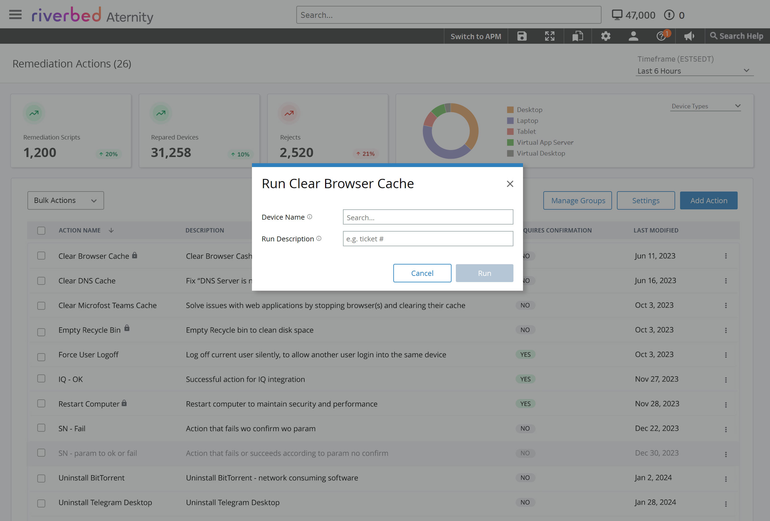
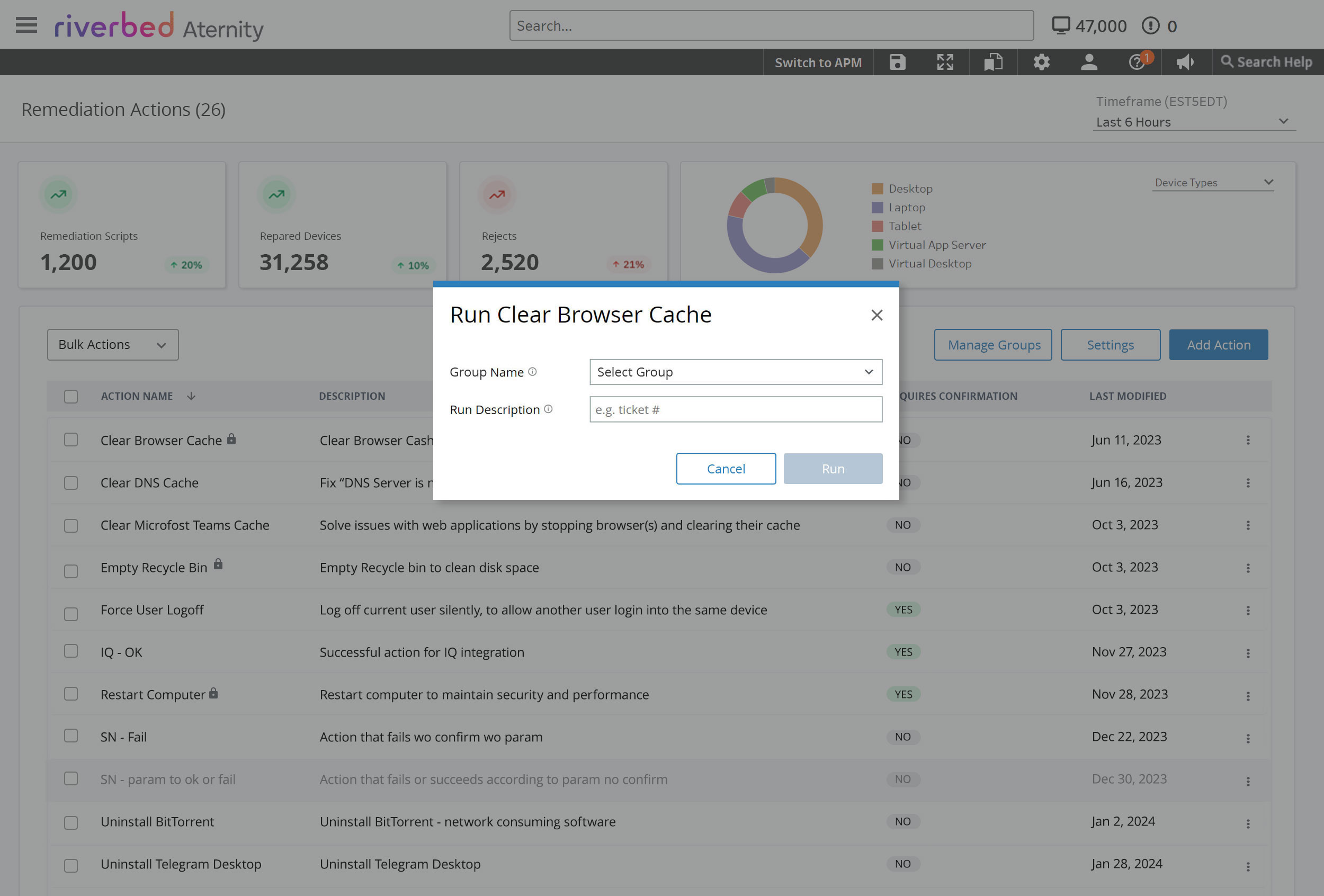
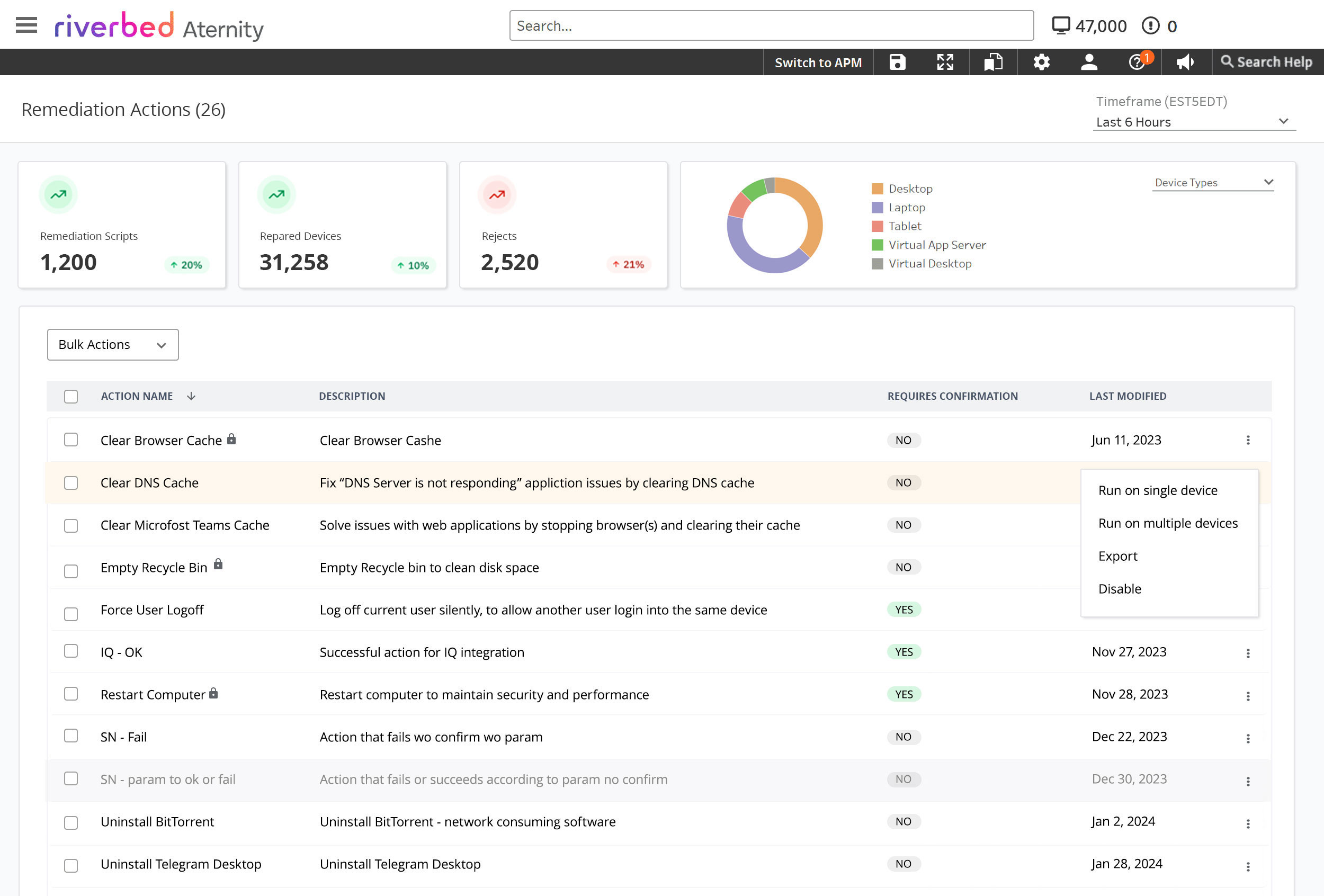
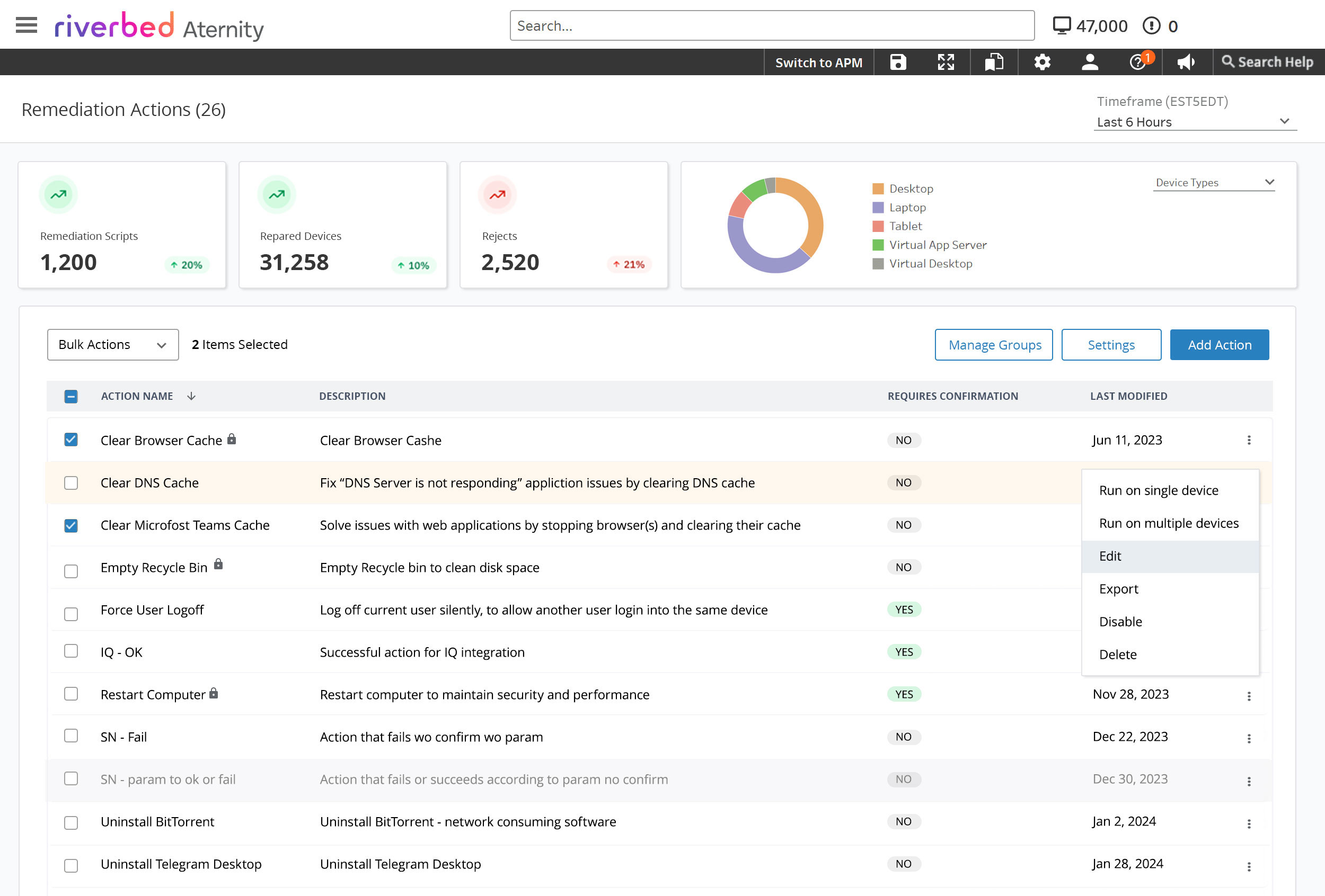
One Run button opening a modal that asks: single device or multiple?
A dropdown with two named options, each opening a modal built for that case only.
The admin already knows which one they want before they click. Asking them inside a modal adds a layer, and the two paths need genuinely different screens — one device is a confirmation, ten thousand is a scoping exercise.
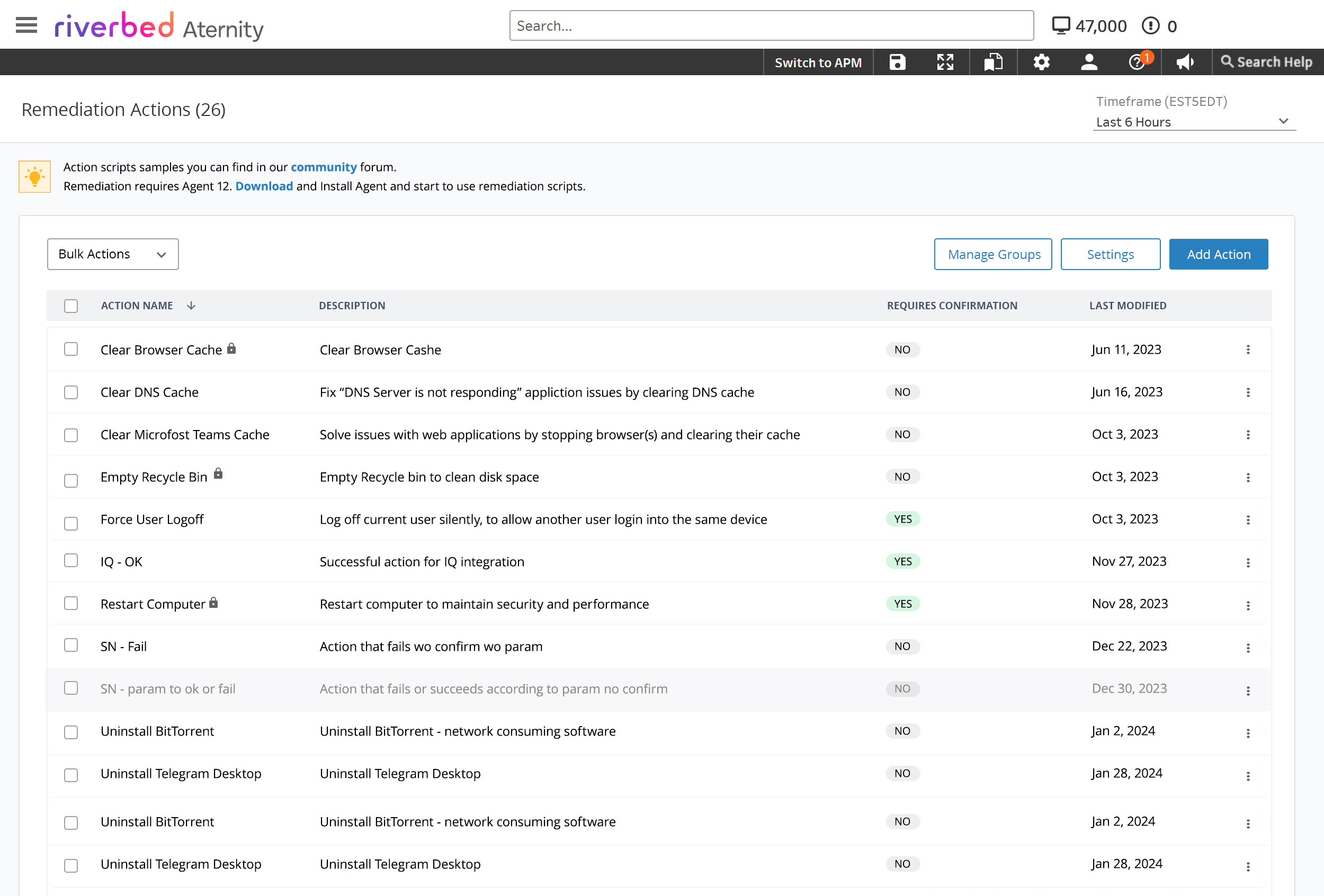
Show every action, disabled, with a tooltip explaining the missing permission.
Hide the controls a role can’t use — the action buttons and menu items simply aren’t there.
A greyed-out button is an invitation to go find someone with the password. Support staff are working a ticket, not auditing their own permissions — a screen with nothing they can’t do is faster and quieter.
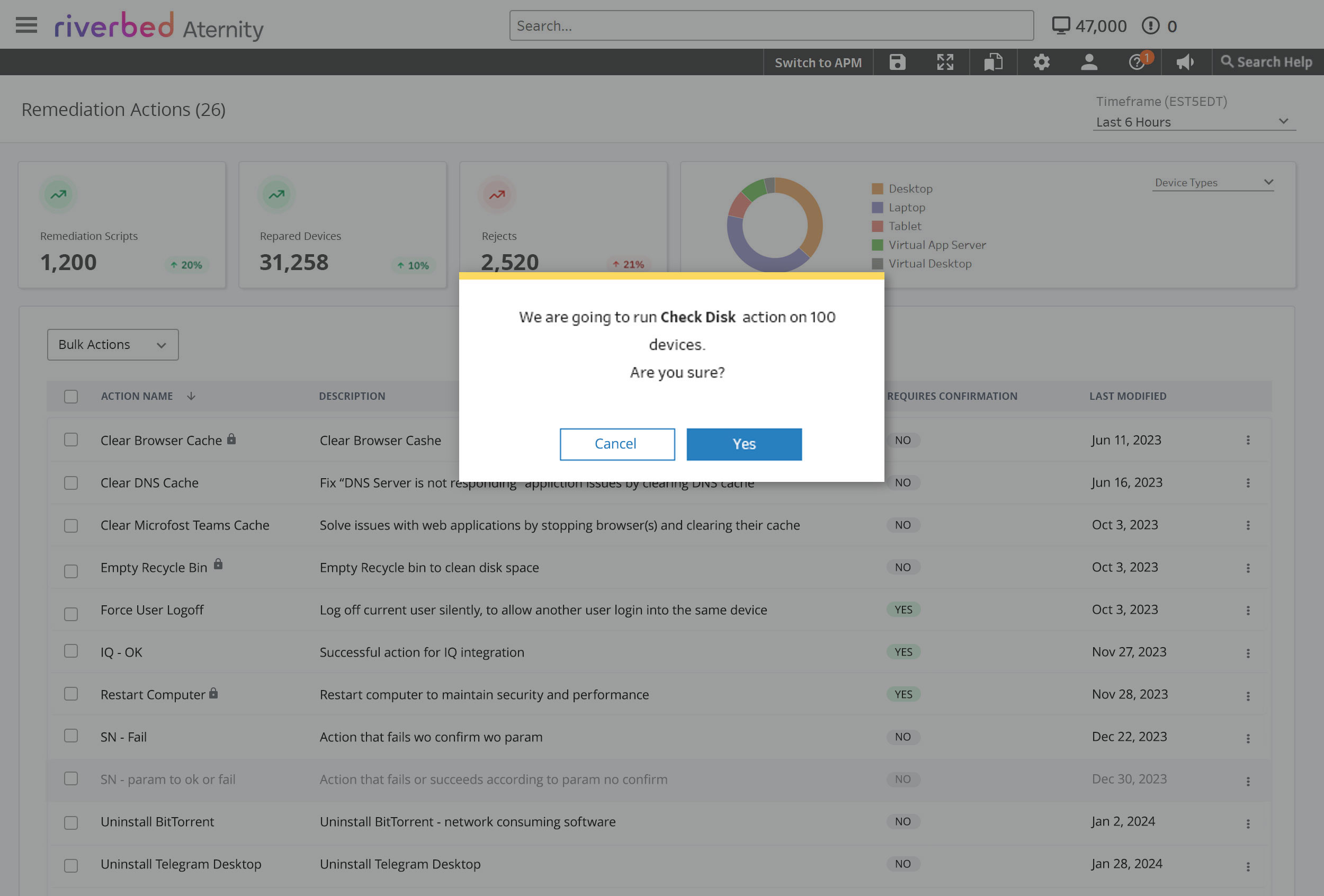
Red on anything destructive — the usual reflex.
Yellow for “this can’t be undone”, red reserved for errors that have already happened.
Red means something went wrong. Running a valid script on the right devices is not an error — it’s a decision with weight. Borrowing the error colour for it teaches people to read red as background noise, and then the real errors stop landing.
Irreversible action. Proceed, but know what you’re committing to.
Something failed. Reserved for errors, never for warnings.
Completed successfully.
Ordinary modals with no stakes attached.
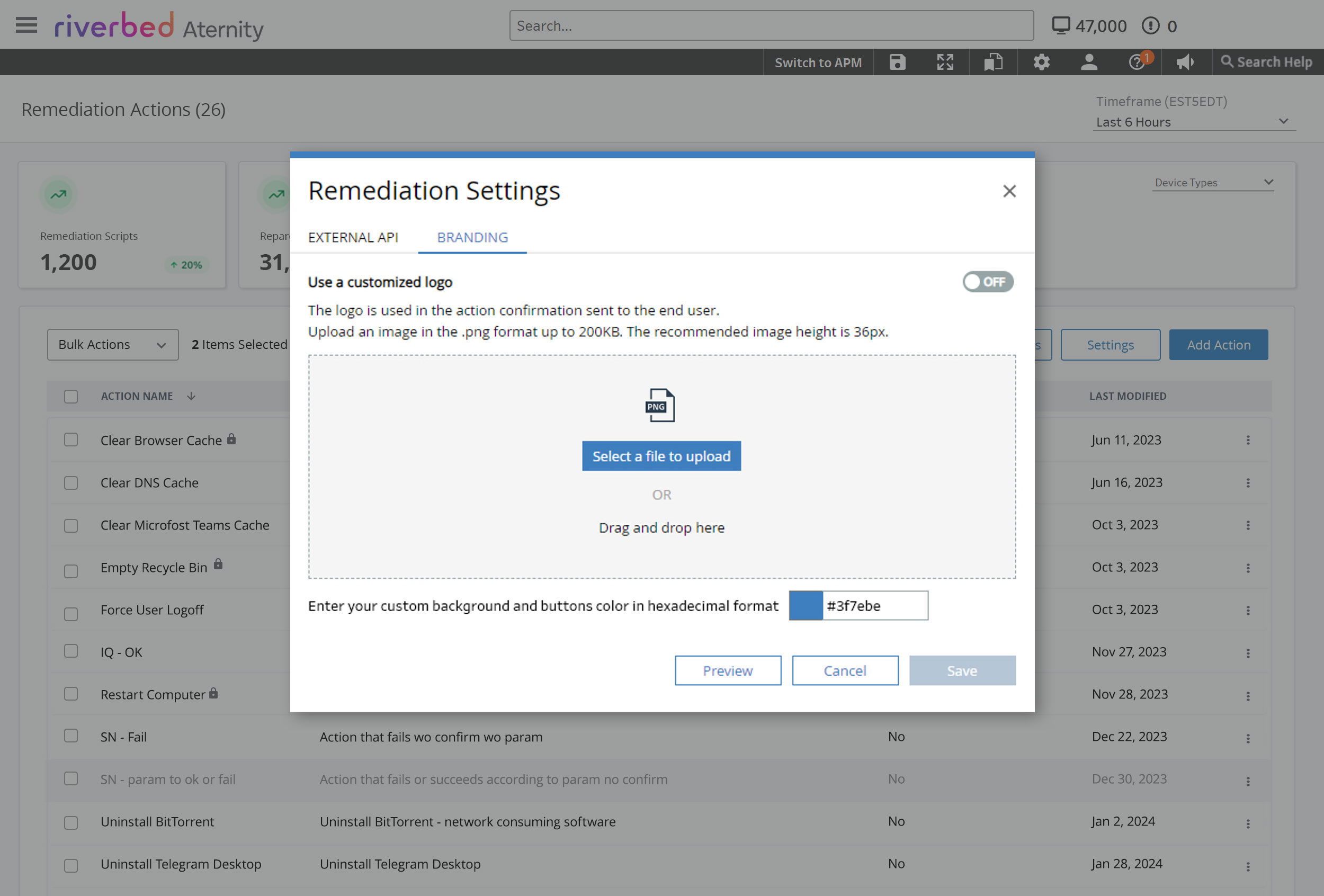
Colour scheme derived from the Aternity Design System, extended to cover the irreversible case it didn’t yet have a token for.
What shipped
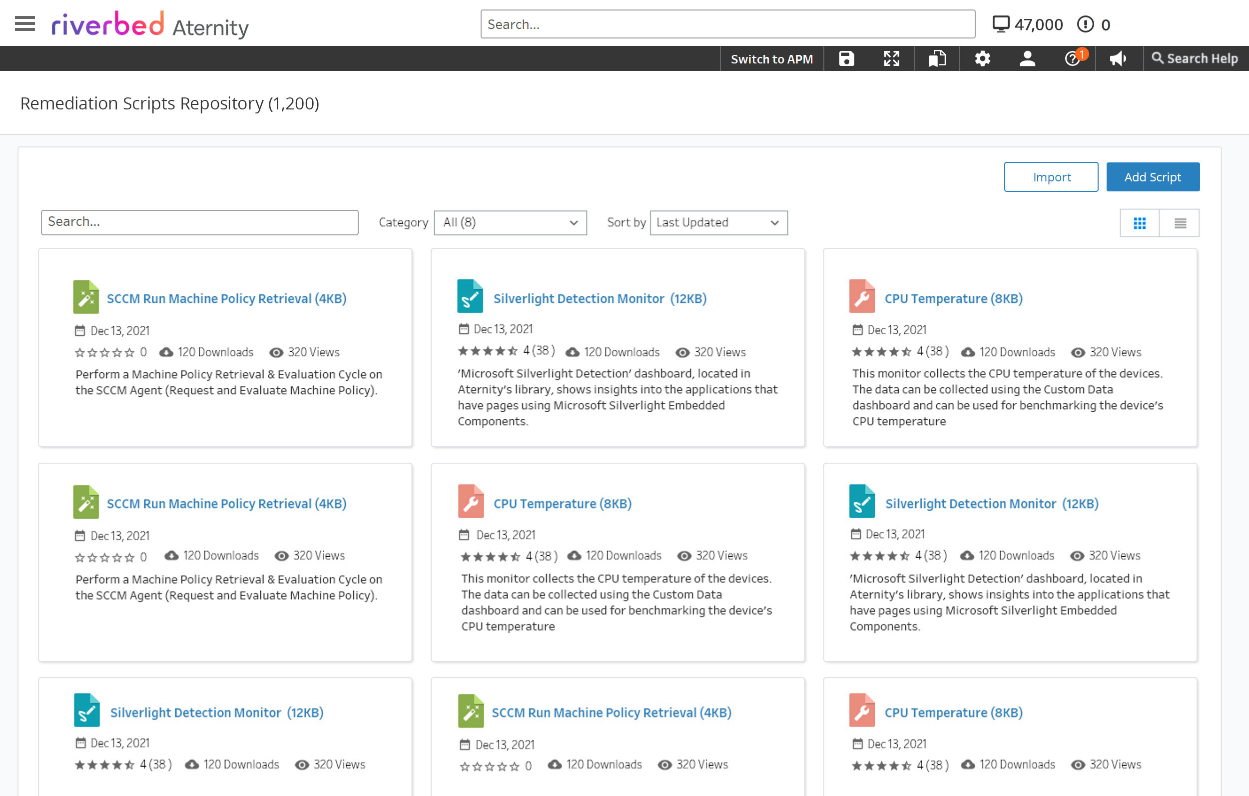
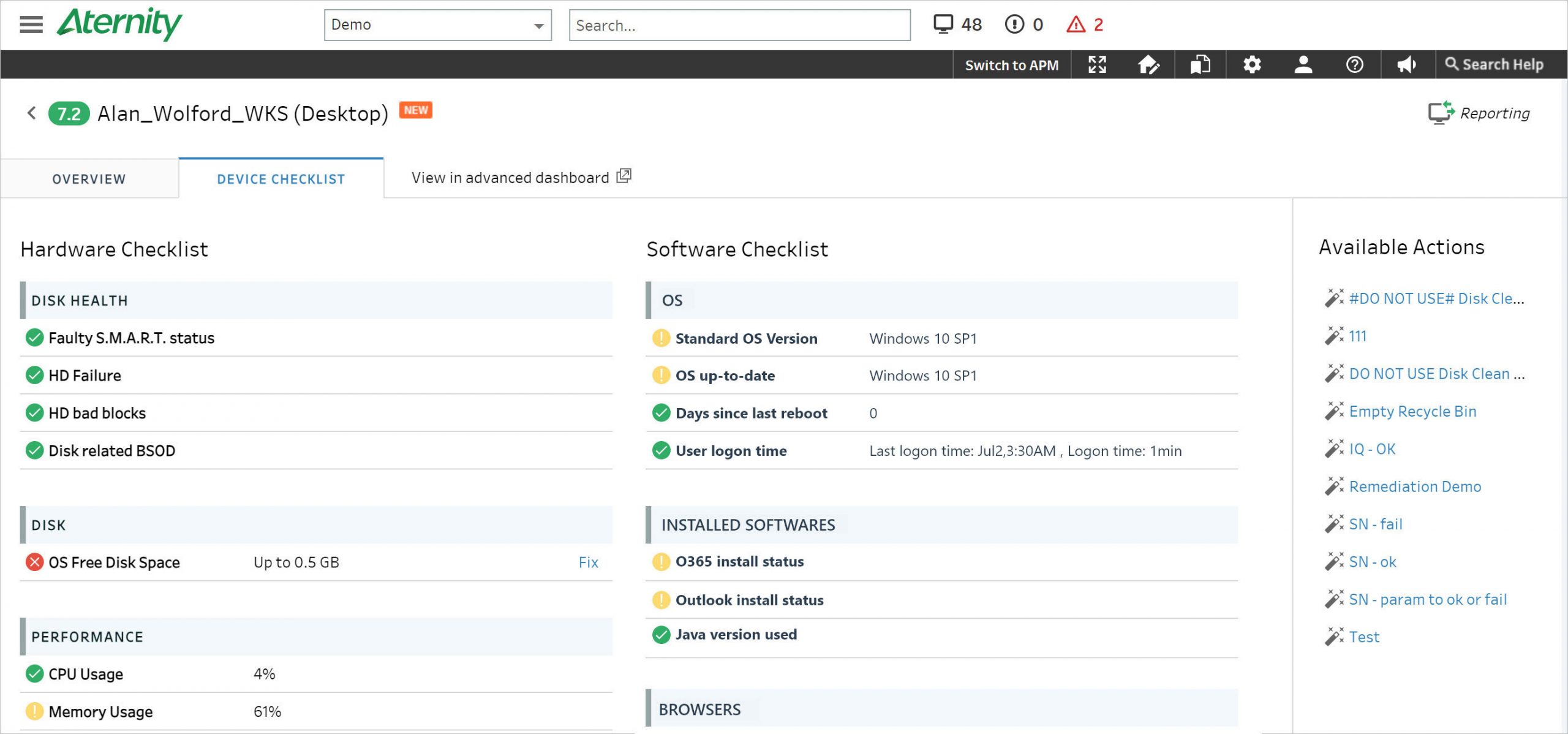
A library, a builder, and a fix button on every screen
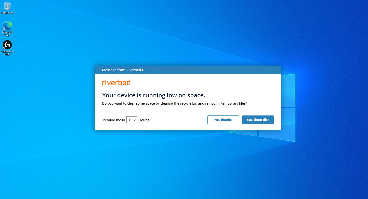
The remaining question: where does an admin actually reach for this?
ServiceNow, without the paperwork
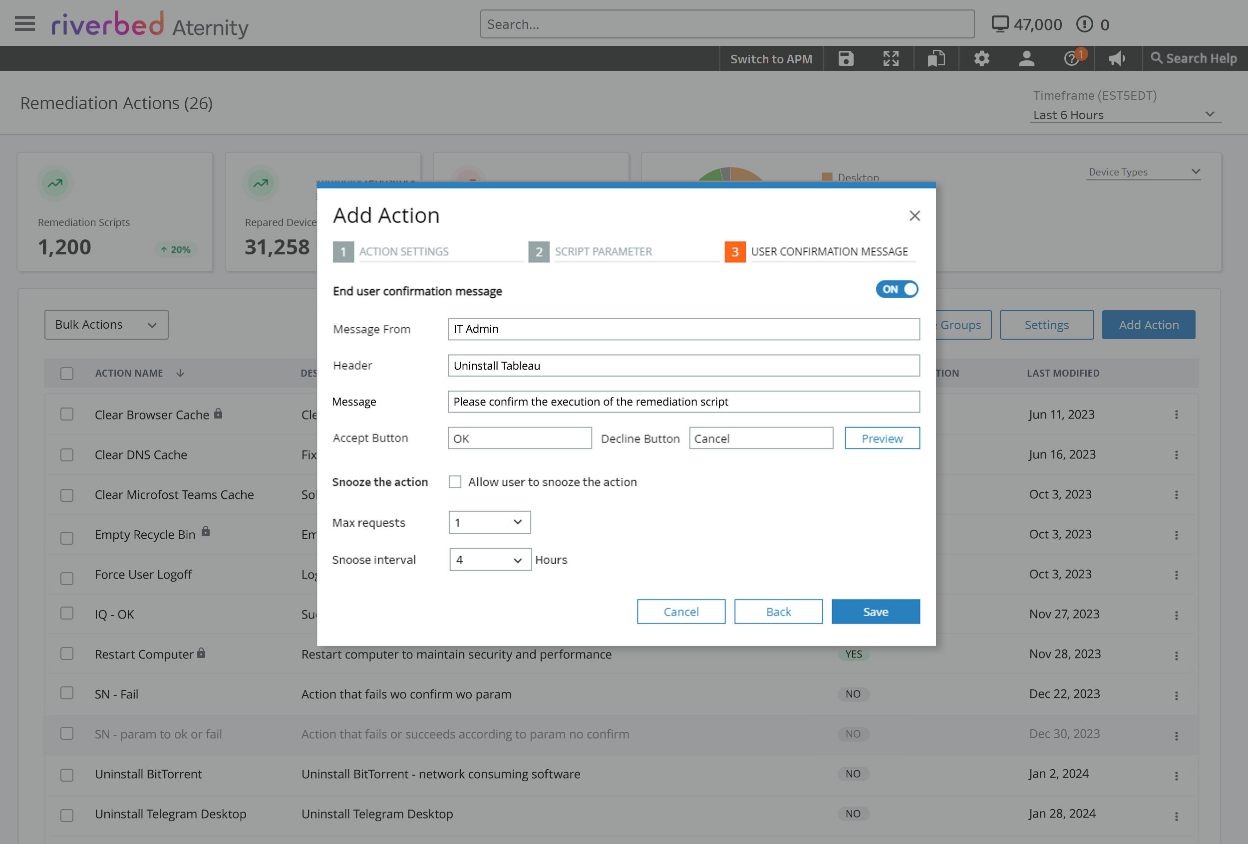
Running a script opens the ticket automatically. The action is tracked for audit without anyone stopping to record it — which is the only version of accountability that survives contact with a busy day.
Cooling periods
If a device closes mid-run, the script halts rather than retrying blindly. The cooling window is backend-defined, one to twenty-four hours, so a failed fix can’t turn into a loop.
Takeaways
What I took from it
Know when the container has failed
The modal-to-page decision is the one I’d defend hardest. It looked like a preference and it wasn’t — the validation blocking, the overlapping preview and the crowding were all the same symptom. Recognising that a pattern has stopped fitting is a different skill from choosing between patterns.
Colour is a vocabulary, not decoration
Spending red on “are you sure” leaves nothing for “it broke”. Reserving a tone costs discipline and pays out every time something actually goes wrong.
Placement is the feature
Deciding where the Fix button lives across the platform mattered more than what the button looked like. A remediation action nobody encounters at the right moment may as well not exist.
Permissions are an interface
Hiding versus disabling looks like an implementation detail. It’s actually a statement about whether you’re designing for the person in front of you or for the org chart.
What I’d do differently
I designed the run flow before the failure reporting. But a script running on ten thousand devices partially fails as a matter of routine, and the screens showing which machines rejected it arrived late. Next time I’d design the rejected-devices view first and let the happy path inherit its vocabulary.