Aternity Design System
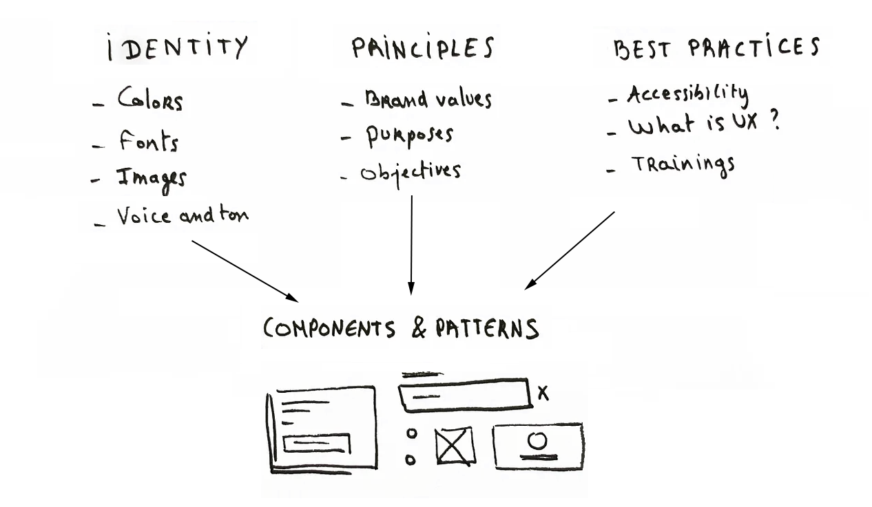
The Aternity Design System is a comprehensive collection of guidelines, components, and tools that ensure consistency and efficiency in product design and development. It includes reusable UI components, design tokens, design patterns, CSS code snippets, interaction guidelines, and downloadable design assets.
Process and Deliverables
Core components and guidelines that form the foundation of the design system
Design Tokens
Color palettes, typography, spacing values
UI Components
Reusable interface building blocks
Design Patterns
Common interaction and layout patterns
Interaction Guidelines
Behavior and animation specifications
Front-End HTML & CSS
Development-ready code components
Preparing the Design System
Building from basic components to complex page templates using Atomic Design Methodology
Atomic Design Methodology
Building the design system from the ground up, starting with basic building blocks and progressing to complete page layouts
🔧 Atoms
Buttons, input fields, labels – basic building blocks
🧩 Molecules
Search forms (input + button) – functional components
🏗️ Organisms
Navigation bars, complex interface sections
📄 Templates
Page layouts with real content structure
Component Prioritization Process
To determine which components to develop next, I conducted an inventory of existing components and reviewed future product wireframes. By comparing these inventories, syncing with product teams, and prioritizing components based on the needs of high-priority new features, I was able to create templates of pages with real content, representing the final product.
Challenges & Solutions
Overcoming integration and consistency challenges across multiple platforms
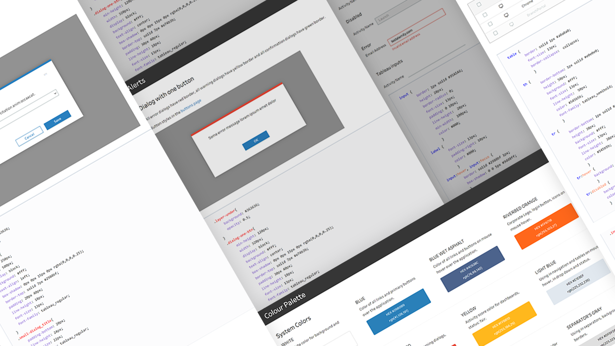
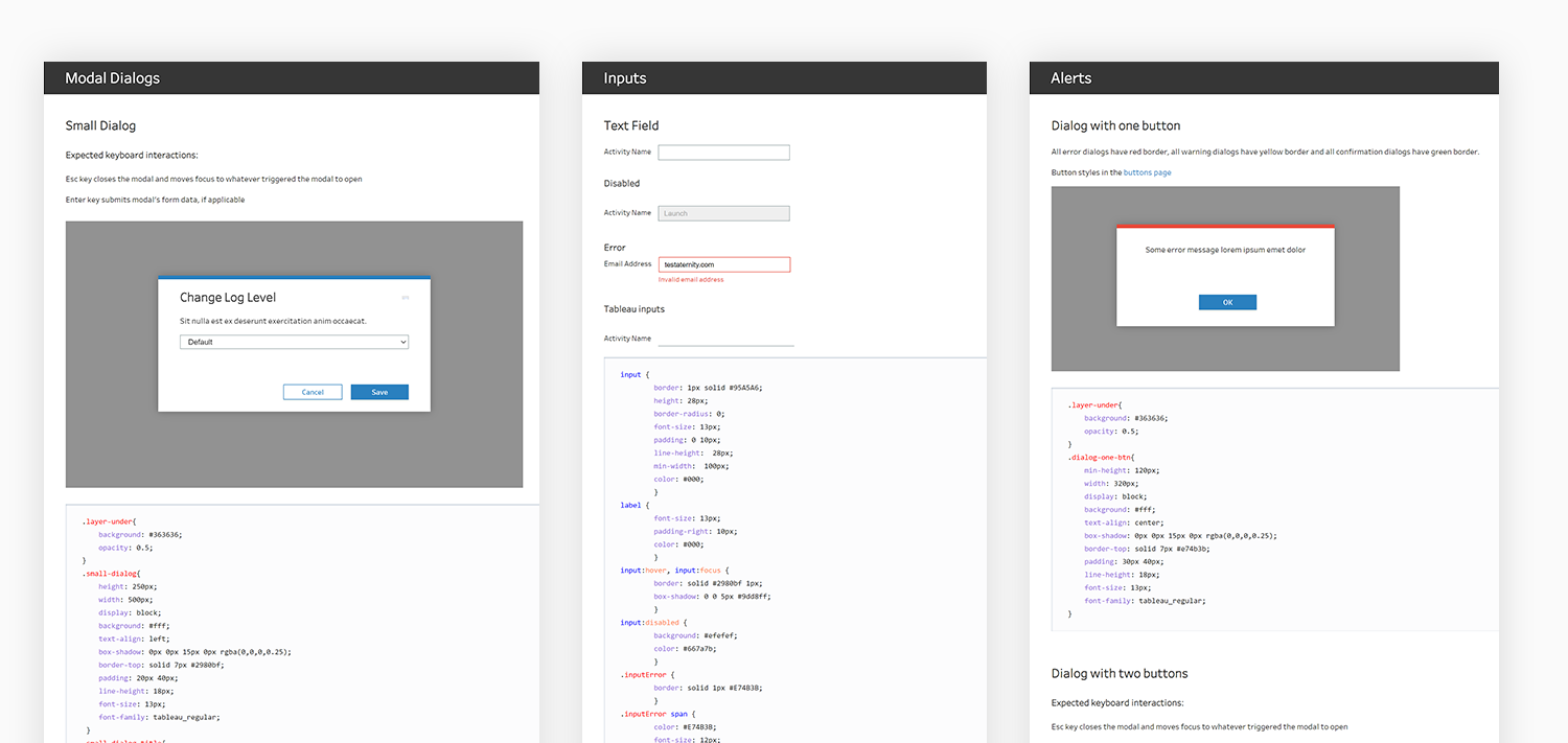
Aternity’s product is built on numerous Tableau dashboards. The primary goal in developing the Aternity design system was to seamlessly integrate Tableau’s UI with Aternity’s UI. Before I joined Aternity, its dashboard had numerous different and unrelated colors. Another challenge was to find a single color for standard bars and charts, with each bar having 2 or 3 tints to represent different measurements, such as application crashes, browser crashes, and HTTP errors.
To prevent the overuse of color palettes, I have decided to select a primary color for all bars and charts, using various tints to distinguish between measurements. This primary color should not resemble the hues used for links and buttons, nor should it resemble the green used for score indicators. It needs to be bright, strong, and of medium saturation, positioned between blue and green on the color spectrum. Additionally, the bar color should be balanced—not too prominent, yet not too washy. Accordingly, for the primary dashboard color, I have searched for several colors for pie charts that maintain the same saturation and brightness.
The main challenge was to integrate three different design systems — Riverbed, Aternity, and Tableau—into one cohesive system.
The UI elements in Tableau, such as fonts, fields, and buttons, are small and lack rounded corners. To address this, I initially worked on fields and buttons, reducing the font size and standardizing it across the Aternity product. Additionally, there are UX considerations such as optimizing filter behavior. I also combined the Riverbed colors with Aternity’s primary blue, which I founded for buttons, links and tabs, to create a color palette for score and alert colors.
Creating Components Checklist
Comprehensive guidelines for developing consistent and accessible design components
Design Specifications
- Spacing: paddings, margins, and auto-layout
- Designing necessary states and checking accessibility
- Adding and cross-checking metadata, naming, and taxonomy
Documentation
- Writing component descriptions and use cases
- Outlining component anatomy, structure, and grid information
- Describing responsive design and screen size implications
Edge Cases
- Showing edge cases and empty states
- Error state handling and validation
- Loading states and transitions
Quality Assurance
- Cross-browser compatibility testing
- Accessibility compliance verification
- Performance optimization review
Approach
Building a Design System involves treating it as a dedicated product with its own team and development cycle
Scope Definition
I began by clarifying the system’s purpose, audience, and timeline. Through stakeholder interviews with developers, product owners, and leadership, we gathered insights on company-wide and product team expectations for the design system.
Component Inventory
Conducted comprehensive audits of existing UI components across all product areas, identifying inconsistencies and opportunities for standardization.
Priority Framework
Established criteria for component prioritization based on usage frequency, business impact, and development resources required.
Cross-Team Dependencies & Collaboration
Aligning multiple teams and establishing effective collaboration processes
Collaborative Approach
In developing the Design System, we faced timeline mismatches initially. To resolve this, we aligned and consolidated roadmaps, enabling the platform to launch an MVP using the Design System within six weeks.
- Aligned and consolidated product roadmaps across teams
- Maintained ongoing dialogue with product teams
- Started with wireframe reviews to identify components
- Evolved from sequential handoffs to iterative delivery
- Fostered early testing and improved collaboration
Achievements
Measurable impact and outcomes of the design system implementation
Brand Recognition
Established a distinctive design language that embodies our brand essence, recognized by customers as a unique selling proposition.
Scalable Foundation
Built a scalable foundation for launching new features, enabling rapid development and consistent user experiences.
Reduced Design Time
Reduced UI design time significantly, redirecting resources to user research and usability testing for better outcomes.
Accelerated MVP Launch
Expedited the MVP launch for the product team, surpassing initial schedule expectations and delivering ahead of timeline.