Craft · Enterprise monitoring · 2021–24
Illustrations
A monitoring platform is diagrams and numbers all the way down. These are the illustrations I drew to give it somewhere to breathe — across product help, the library, empty states, and a character who shows up when something has gone wrong.

Why draw at all
Enterprise software is exhausting to look at
The question behind all of it: what does a screen full of charts need that another chart can’t give it?
Aternity is a platform people open when something is broken, and spend all day reading. Every screen is dense, every screen is data, and the visual load never lets up. Illustration was the only element on the page whose job wasn’t to inform.
Which is exactly why it had to be disciplined. A decorative drawing in a serious tool reads as unserious. The constraint was doing this without making the product feel like a toy.
Where they had to work
Product help, library pages, empty states, error pages, onboarding — different contexts, one visual family.
What they had to survive
Web and print, dark UI and light, thumbnail scale and full-page hero. Consistency across all of it or the brand frays.
What they couldn’t do
Compete with the data, add ambiguity to an already complex idea, or lean on imagery that reads differently in another culture.
Decisions
What I considered, what I chose, and what made the difference
A distinct illustration style with its own palette — visual relief through contrast.
The application’s own colour palette, applied to a consistent line style across every piece.
Illustration that arrives from somewhere else reads as stock. Drawing inside the product’s palette means each piece looks like it was made for the page it’s on — and it’s the difference between decoration and identity.
No character. Enterprise tools should stay neutral, especially when something has failed.
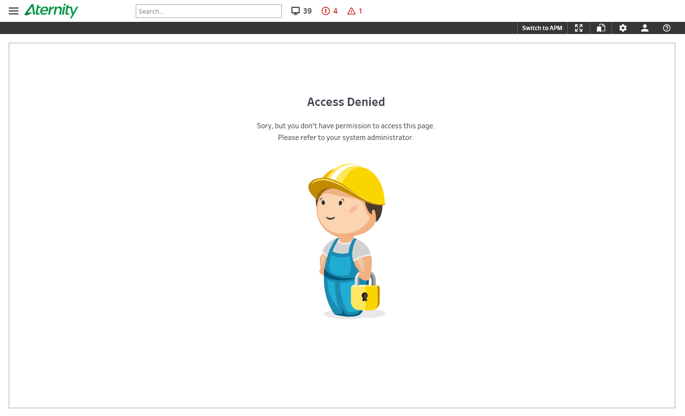
Bob — used only on maintenance, 404 and access-denied pages, never in the working product.
Those are the screens where someone is already frustrated and there’s no data to show. Warmth costs nothing when the page has failed anyway. Confining him to dead ends is what keeps him from undermining the tool everywhere else.
A drawing in enterprise software has to earn its place twice — once as an image, once as a thing that isn’t a chart.
Set 01
Product Help
Drawn for the Aternity Product Help site, where people arrive already stuck.






Set 02
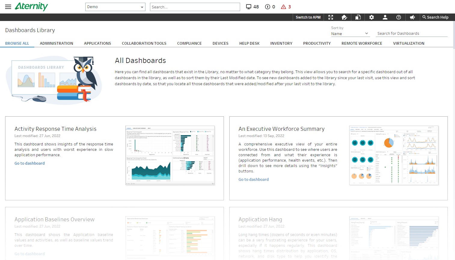
The Library
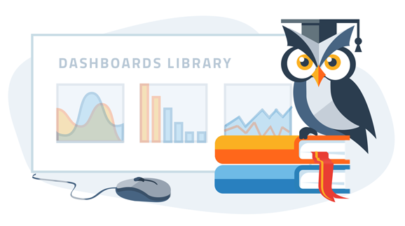
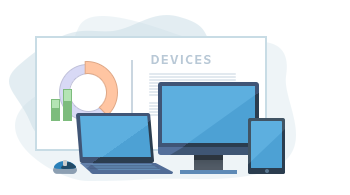
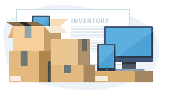
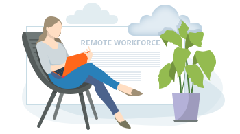
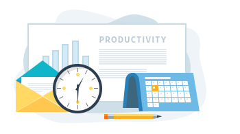
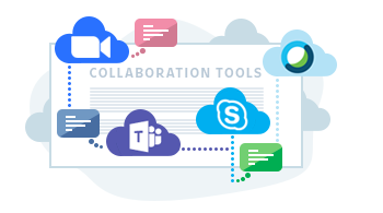
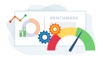
Fifteen pieces, one per library page — each carrying its own page title in the background.
These sit to the left of each page description. Embedding the title into the artwork means the illustration identifies the page rather than just decorating it — someone scanning the library recognises where they are before they read a word.








Set 03
Across the product
The same family, spread across screens that have nothing else in common.






Set 04
Bob
A character for the screens where there’s nothing useful left to show.
Maintenance pages, 404s, access denied. Bob only appears where the product has already failed the person — never inside the working tool. That restriction is the whole reason he works. A mascot that turns up during normal use undermines a platform people trust with production systems; one that turns up at a dead end just makes a bad moment slightly less cold.









Takeaways
What I took from it
Restriction is what makes tone safe
Bob works because of where he isn’t. The same character sprinkled across the product would have cost credibility that a monitoring platform can’t spare — deciding the boundary was more of the design than drawing him.
Illustration is a system, not a set of pictures
Thirty-odd pieces across web and print only hold together if the line weight, palette and level of abstraction are decided once and then obeyed. That’s the same problem as a component library, drawn instead of coded.
Ambiguity is the failure mode
A chart that’s unclear is annoying; an illustration that’s unclear is worse, because people assume it means something. Every piece got tested against a single question — what would someone think this is about?
Feedback without dilution
Illustration attracts more opinions than any other deliverable, because everyone can see it. Learning to take the useful notes and hold the line on the rest was most of what this project taught me.
What I’d do differently
I drew each set as its own project and reconciled the style afterwards. Writing the rules first — weight, palette, abstraction, what never gets drawn — would have saved a redraw pass and made handing the work to someone else possible.