Case study · Enterprise monitoring · 2021–24
Aternity Insights
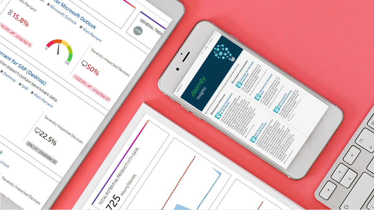
Aternity collected more data about end-user devices than anyone could read. Insights was the attempt to make it say something without being asked — and the design problem was fitting proactive findings onto a screen already full of numbers.
The problem
The data was already there. Nobody was reading it.
The question I started with: how do you surface a finding on a screen that already has no room left?
Aternity’s reporting could answer almost any question an IT team asked. The trouble was that asking is work — someone has to suspect a problem before they go looking for it, and most problems don’t announce themselves.
Insights inverted that: the platform proposes what’s worth looking at. Which turned an analysis problem into a layout problem. Proactive findings need somewhere to live, and every pixel on the screen was already spoken for.
Usability audit
Heuristic evaluation of the existing interface, alongside interviews and a review of how the screens were actually being used.
- Navigation buried the findings
- No way to tell state from a glance
- Density had accumulated, not been designed
Stakeholder alignment
Worked with the product owner to separate what could ship now from what needed a longer runway.
- Short-term fixes to the existing flow
- Longer-term restructure of the insight surface
- Cross-team dependencies mapped early
Competitive analysis
Benchmarked how comparable platforms presented automated findings versus queried reports.
- Most treated insights as a separate destination
- Few made the finding actionable in place
- Delivery outside the product was rare
A proactive insight that lives on its own page isn’t proactive. It’s another page you have to remember to open.
Decisions
What I considered, what I chose, and what made the difference
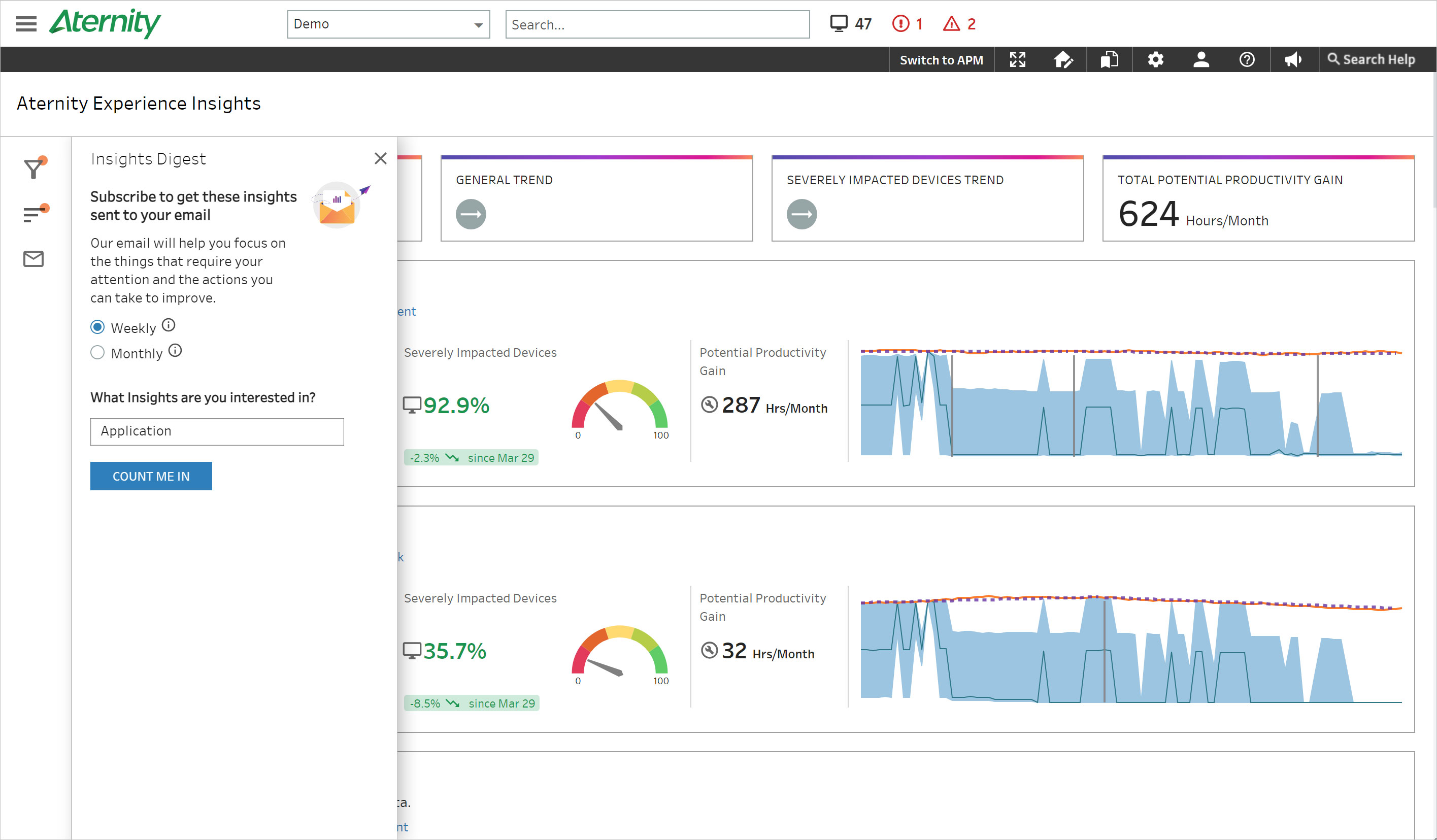
A subscription widget placed on the main screen where it’s most visible.
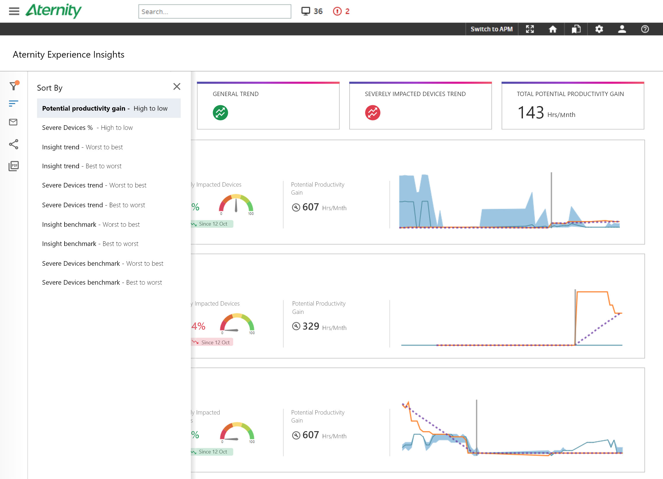
Move it into the sidebar, grouped with sorting and filtering.
Subscription is a preference, not a finding. Putting it on an information-dense screen costs space from the content people came for — and it belongs next to the other controls that shape what you receive.
Leave the sidebar open, so the active filters are always readable.
A collapsible sidebar with an orange indicator that appears whenever filtering, sorting or digest settings differ from default.
A permanently open sidebar solves the state problem by taking the screen back. The real risk is someone reading a filtered view as the whole picture — one indicator answers that without holding the space hostage.
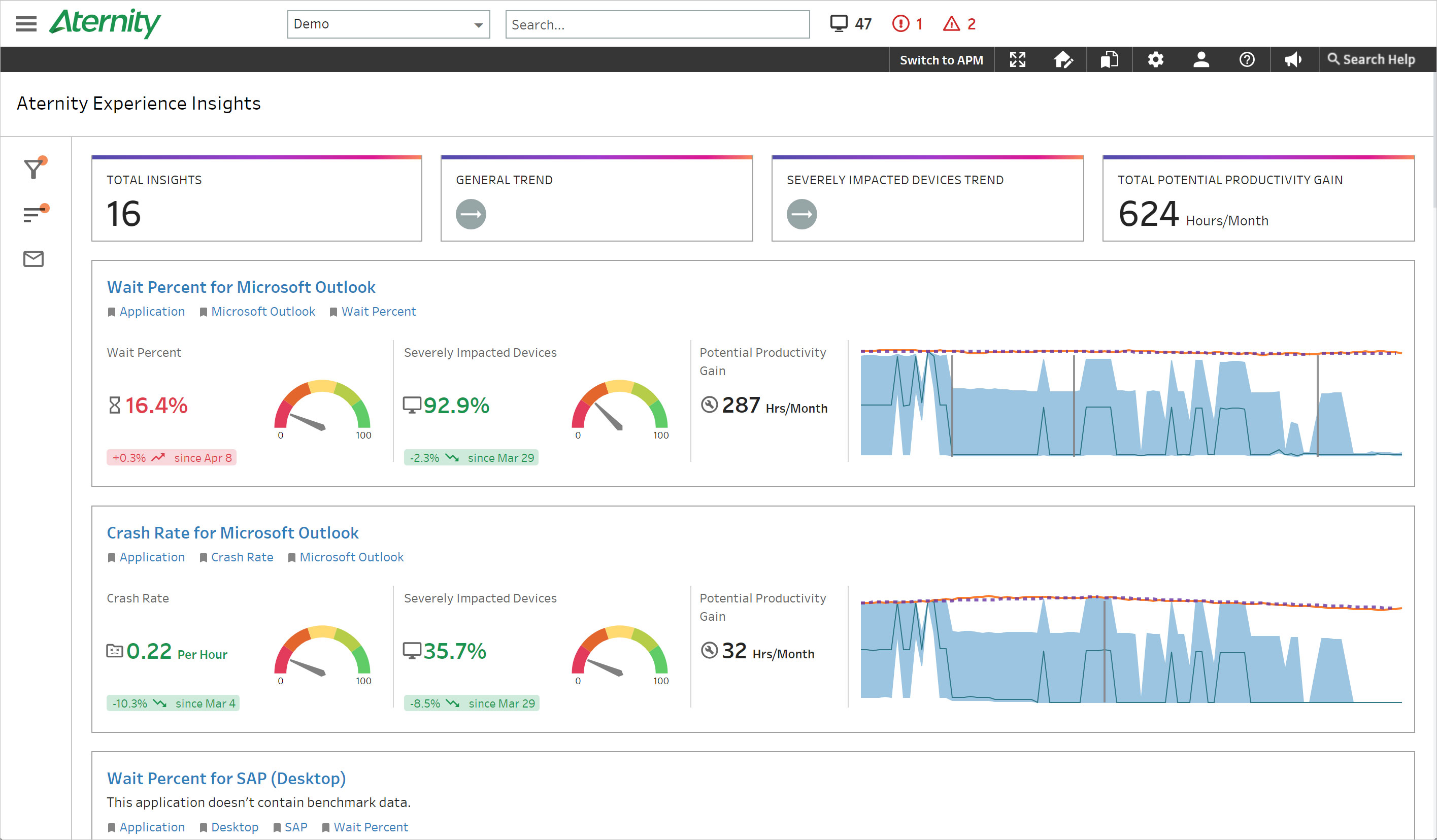
Plain number blocks matching the rest of the platform’s card styling.
Gradient-bordered blocks with icons chosen per metric rather than a generic set.
These numbers are the summary the rest of the screen elaborates on. They need to separate visually from the detail below, and a generic icon set makes six metrics look like one thing repeated six times.
Insights live on the Insights page. Come and look at them.
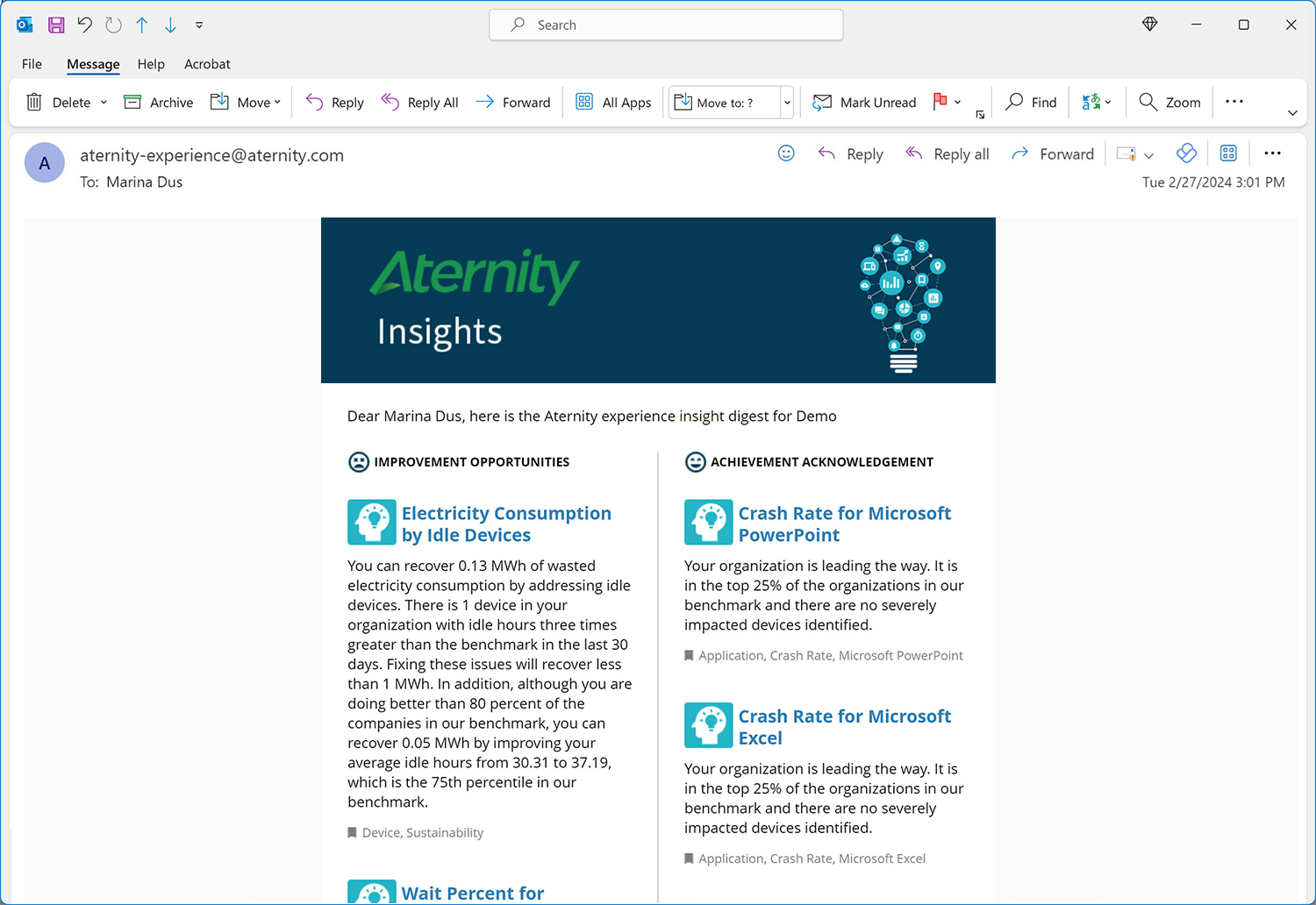
A subscribable digest that arrives on its own, tagged to the user’s preferences.
The whole premise is that the platform notices things you weren’t looking for. That only works if it can reach you somewhere you already are — otherwise you have to be looking, and we’re back where we started.
A ranked list, most significant finding first.
Two columns — improvements and achievements — side by side.
A ranked list of problems is a list of things you failed at. Splitting the columns means the digest reports what’s working alongside what isn’t, which is the difference between something an admin forwards to their manager and something they close.
What shipped
Three surfaces, one finding
Usability audit
Heuristic evaluation, interviews and analytics on the existing screens.
Design strategy
A roadmap separating what could be fixed now from what needed restructuring.
Prototyping
Wireframes through to high-fidelity Adobe XD prototypes, plus the visual system.
Testing
User sessions, issues logged, iterations run against the findings.
Implementation
Build support through to relaunch, monitoring feedback afterwards.
Process — five stages across the engagement
Takeaways
What I took from it
Proactive means leaving the product
The digest is the decision I’d defend hardest. An insight that requires you to visit a page isn’t proactive — it’s a report with better marketing. Designing the delivery mattered more than designing the page.
Density is a budget
On an information-heavy screen, every new element is taken from something already there. The subscription widget and the collapsible sidebar were both about spending that budget on findings rather than controls.
Hidden state needs a tell
Collapsing the sidebar was only safe because the indicator existed. Any control you hide needs a way to announce that it’s doing something.
Report the wins too
The two-column digest changed how the feature was received. A tool that only reports failures gets read defensively; one that shows progress gets forwarded.
What I’d do differently
I designed the insight surface before deciding what counts as an insight worth surfacing. Relevance is the whole product — a beautifully laid-out digest of things you don’t care about is worse than no digest. Next time I’d pin down the ranking logic first and let the layout follow it.