Case study · Identity Security · 2026
Connection Trust
A customer connected their directory, saw “Connected”, and found out six weeks later that a whole category of data had never arrived. Here’s how I worked it out.
Outcome states designed
Written as a table before I opened a design file
Integrations to absorb
One pattern that survives every vendor in the catalogue
Design system components
Chips and result panels the team still reuses
Scope of the work — not performance claims
The problem
Three different failures, one identical screen
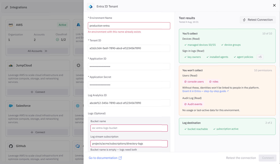
A denied permission, a throttled API and a genuinely empty tenant all produced the same thing: nothing. No data appeared, and no screen was willing to say why.
I started by reading a quarter of production issues rather than sketching. Setup and validation problems were the largest single theme — and almost none were visible at setup. That reframed the brief for me: the failure wasn’t in the connection. It was in the reporting of it.
Nobody looks twice
Issues surfaced weeks later via a missing finding, never at setup. I stopped treating this as an error-message problem.
“Connected” means “everything”
On customer calls, people read one word as a guarantee about all their data. Blame landed on the platform, not the permission.
The backend knew less than the UI claimed
Engineering walked me through what’s actually verifiable at connect time. Far less than the screen was asserting.
How I worked
Four moves, in the order I made them
Read before drawing
A quarter of support issues and three customer calls, to find where trust actually breaks.
Audit what exists
Walked the production UI looking for somewhere this already belonged — and found it.
Model in words
Wrote all fourteen outcomes as a table with engineering before any layout existed.
Ship into the system
Published chips and panels as components so the decisions outlive the screen.
Why are we building this? It’s already built.
The obvious path was a new screen — a connection health page. I’d started specifying it when I went back through the production UI and found the panel where people already edit an integration, with a Test Connection button sitting right there in it.
The project wasn’t missing a home. It was missing a result.
That button returned pass or fail. Everything the roadmap wanted — what’s collected, what isn’t, why — could live inside a panel users already knew how to open. It deleted a screen from the plan.
I hold onto this one because my instinct to add surface is strong and almost always wrong. The audit — what already exists that this belongs inside? — now runs before I design any new page.
What does the system actually know, and what is it only assuming?
Most of my early mistakes here were the same kind: a label claiming more than the backend could support. Correcting the domain model turned out to be most of the design work.
“Collecting logs” is consent, not health. It means the customer approved collection — nothing about whether logs arrive. I’d drawn it as a status indicator, then cut it from the health vocabulary entirely.
The scope noun differs per vendor. Organisations, tenants, projects, workspaces — sometimes a count, sometimes a name. My fixed three-column layout would have broken on integration number two.
Unreachable is not zero. If we can’t reach the integration, every entity reads “unknown” — never zero. A zero is a claim about their environment we have no right to make.
That last one is the project in miniature: almost every bug came from the interface asserting something it hadn’t verified.
What are all the ways this ends?
Fourteen outcomes, four families — written in a doc, not Figma. Two of them existed in no spec and no ticket. They came from asking what happens when the connection works perfectly and there’s still nothing there.
- Untested — nothing run yet
- Testing in progress
- Config edited since last test
- Stored result, six weeks old
- Couldn’t connect — credentials rejected
- Couldn’t check — throttled or timed out
- Connected, reads nothing back
- Everything collects
- Partial — a permission is missing
- Optional source denied
- Capability not licensed
- Connected, tenant returns zero objects
- Log store readable but empty
- Log destination blocked or missing
The grouping is the design decision. Reachability is ours to fix. Entity problems are the customer’s, and get a direct link. Empty results are nobody’s fault and must never be dressed as an error. Colour follows ownership, not severity.
Where does the answer actually land on screen?
Fourteen outcomes don’t fit under a button. The one sat below every field in a single-column form — so its answer rendered below the fold, on the screen where it was the only thing anyone cared about.
The answer to the user’s only question arrives where they can’t see it.
- Users
- Groups
- Applications
- Sign-in logs
- Will collect
- Won’t collect
- Not licensed
Panel visible from the first second, primed with what’s about to be checked — never an empty box.
Connect is gated on a test
“Find out later” was the original defect, so Connect stays disabled until a test has run. The two buttons also validate different things — theirs and ours — which keeps clear which side failed.
Re-testing never wipes the result
Rows resolve in place as checks return, rather than the panel clearing. A failed re-test doesn’t erase the record of what worked ten seconds ago.
How does this survive after I stop looking at it?
A screen decays; a component gets inherited. So the deliverable wasn’t a mockup — it was a page in the shared design system: six chip states, five panel tones, and the rules for when each applies.
- Will collect
- Won’t collect
- Couldn’t check
- Not licensed
- Testing…
- +3
One late colour change mattered more than its size suggests. Denied entities were pink, borrowed from the critical scale. I retoned them amber and kept pink for things that genuinely don’t exist — because if the strongest colour shows up on a routine missing permission, it means nothing by the time something is actually broken. A colour scale is a promise.
Problem → solution
The whole project, on one screen
Where it landed
What shipped, and what I’d do differently
14 outcomes shipped
Across test, edit and reconnect — including a stale stored result and a gated update.
One whole screen avoided
The result lives where users already were, not on a page nobody would find under pressure.
A success message that lied, replaced
“Connected” now names exactly what is and isn’t arriving, at the moment of setup.
What I’d do differently
I modelled one flagship vendor in full detail first, and it turned out to be the least representative integration in the catalogue — about two weeks of rework. The product lead’s instinct was right and mine was wrong: design the generic case first, and treat the biggest, loudest integration as the special case it usually is.
All visuals rebuilt with synthetic data. Product and vendor names withheld under NDA.