Case study · Enterprise monitoring · 2021–24
Web Activities Creator
Defining what Aternity should measure on a web app used to mean writing a signature by hand and hoping it matched. This is the Chrome extension that let you point at the page instead — and the design problem was building an interface that has to share the screen with somebody else’s product.
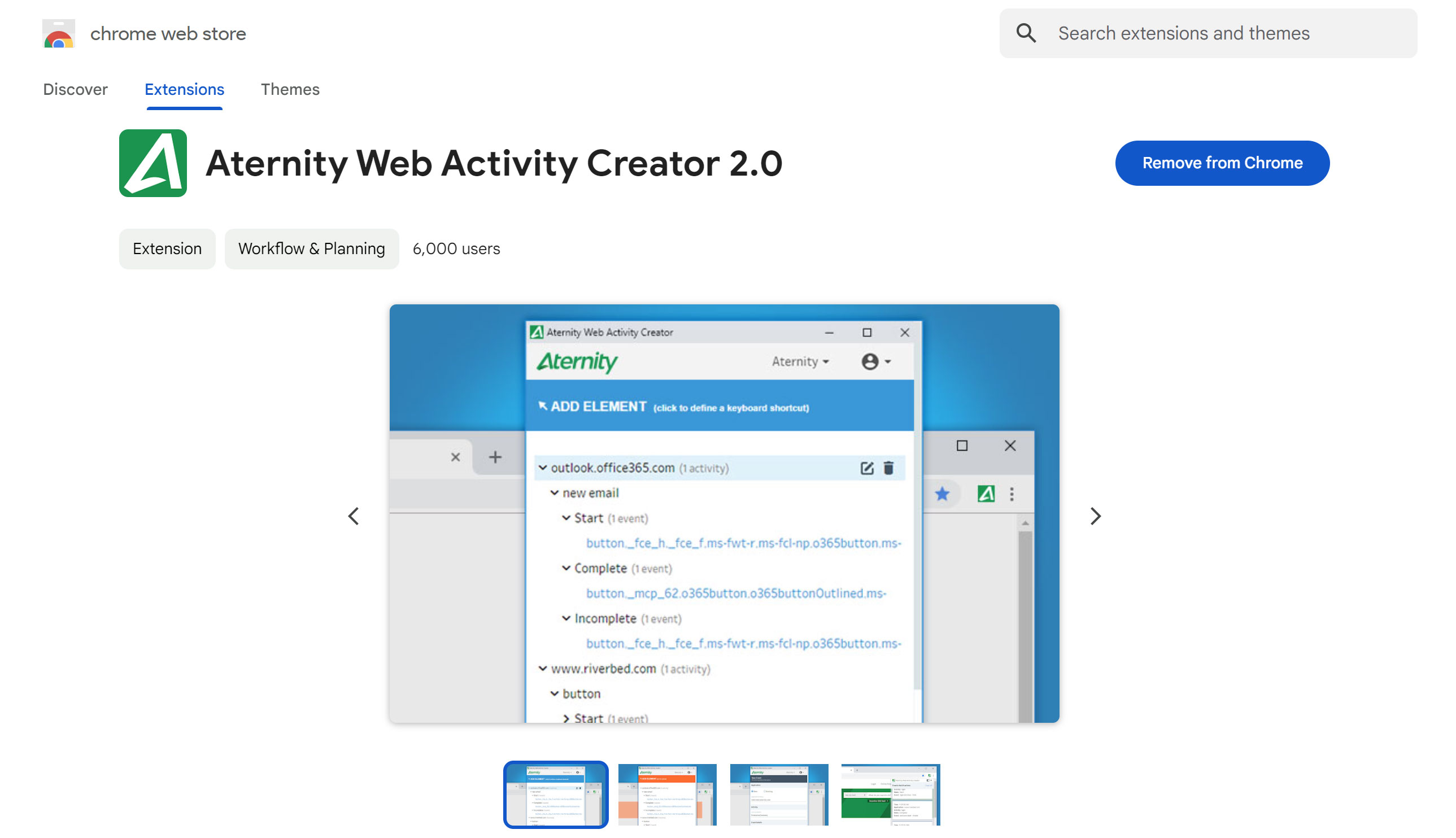
View on the Chrome Web Store →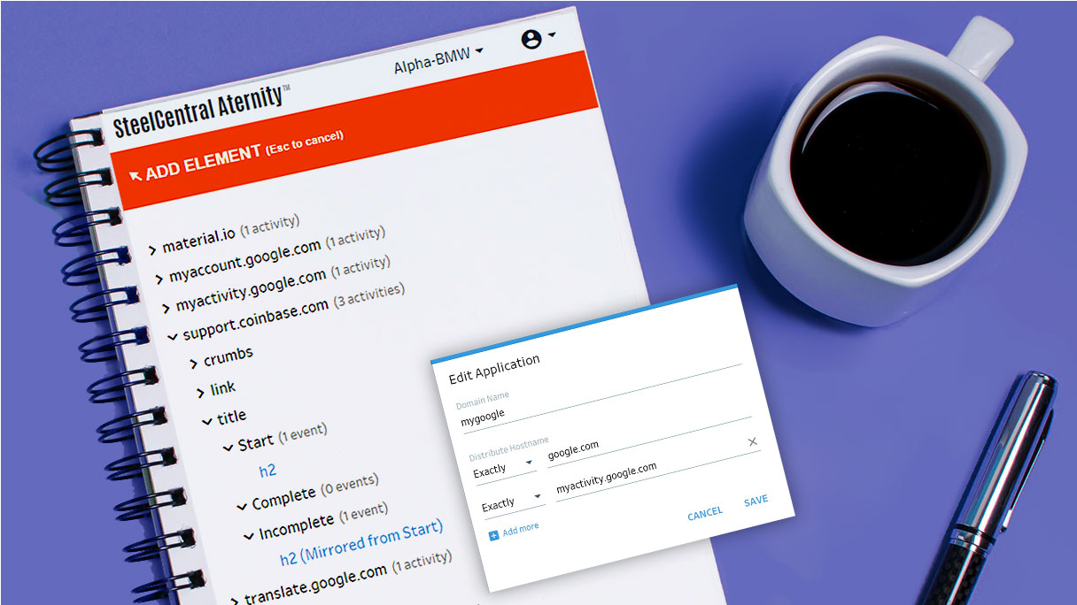
The problem
You had to describe the button without looking at it
The question I started with: why is defining what to measure harder than the measuring itself?
Aternity could measure the response time of any interaction in a web app — once someone told it which interaction. That definition lived in an XML signature, written away from the page it described, against elements the author had to identify from memory or from devtools.
The tooling asked people to describe a page in the abstract, then find out at monitoring time whether they’d described it correctly. The obvious fix was to move the authoring onto the page itself, which meant leaving the platform entirely and living in the browser.
Research
Interviews and analytics on how activity definitions were actually being created and where they went wrong.
- Signatures written blind, verified late
- Errors surfaced only once monitoring ran
- Most users weren’t developers
Competitive analysis
Benchmarked against comparable browser extensions and activity-definition tools.
- Element-picking was the established pattern
- Few handled large activity sets well
- Onboarding was almost universally absent
Usability testing
Multiple rounds against Figma prototypes, focused on the sidebar’s coexistence with the host page.
- Users lost track of what was selected
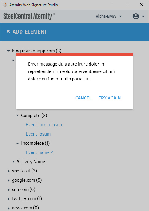
- Long activity names broke the layout
- The handoff to Aternity needed spelling out
Every other screen I’ve designed owned its whole viewport. This one was a guest.
Decisions
What I considered, what I chose, and what made the difference
A screen inside Aternity where you paste a URL and define activities against a rendered copy.
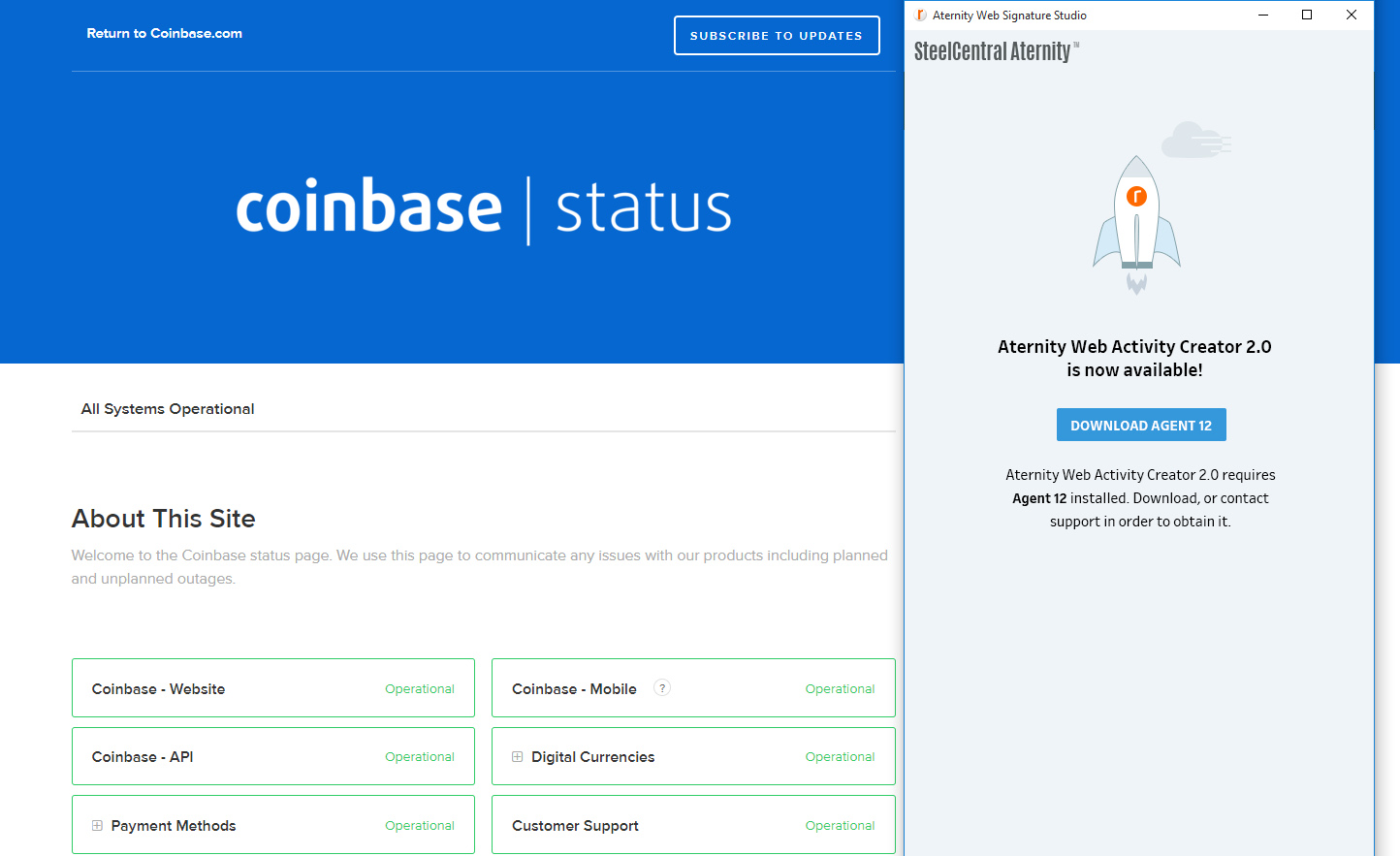
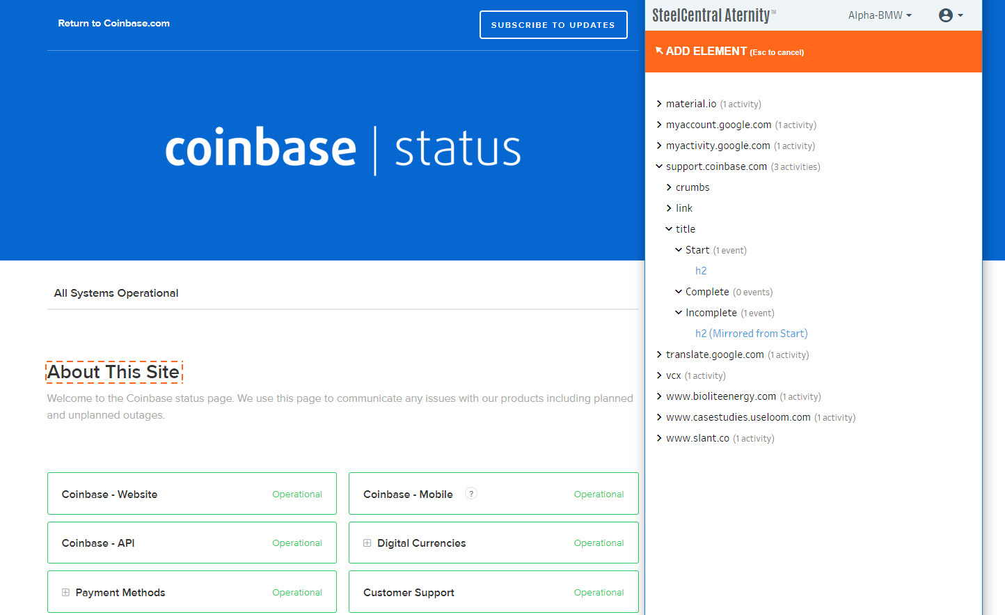
A Chrome extension opening as a floating sidebar beside the live page.
The apps being monitored are behind logins, behind VPNs, and full of state you only reach by using them. A rendered copy is a screenshot of the easy case. The definition has to be made against the page as it actually is when someone works in it.
An overlay panel centred on the page — more room, clearer focus.
A floating sidebar pinned to the side, leaving the page visible and usable throughout.
You can’t select an element you’re covering. The whole premise is working against the real page, so any pattern that obscures it defeats the reason the tool exists — the extension has to stay subordinate to the thing it’s pointing at.
A flat scrolling list with a contextual menu on each row.
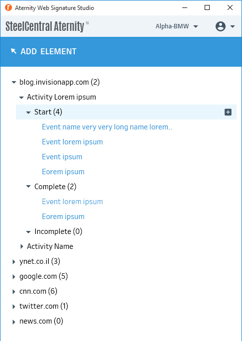
A collapsible tree, with filtering and sorting, and a count in brackets on every collapsed branch.
A sidebar is a few hundred pixels wide and the lists run to hundreds of entries. A flat list makes you scroll to know what you have. Collapsing with a visible count means the structure is readable without expanding it — you can see the shape before you see the contents.
Wrap the name onto a second line so it’s always fully readable.
Truncate with an ellipsis, keeping every row a consistent height, with inline rename available.
Wrapping makes row height unpredictable, which destroys scannability in a tree of two hundred items. The ellipsis is an honest signal that there’s more, and rename means the user can fix the underlying problem rather than the display of it.
What shipped
Point at the page, export, import, monitor
The remaining question: how does something built in the browser get back into the platform?
Create
Open the extension on the target page and select the elements that represent the interaction.
Configure & test
Set response time measurement and success criteria, then verify the definition captures the workflow.
Export
Download the activity as a signature XML file.
Import & monitor
Upload on Aternity’s Activities screen, confirm the import reads correctly, and monitor from Manage Applications.

Takeaways
What I took from it
Designing as a guest
Every constraint on this project came from the same source: the interface doesn’t own the screen. Width, opacity, placement, when to get out of the way — none of those are choices you make in a normal product, and all of them mattered more than the visual design.
Truncation is a decision, not a fallback
Ellipsis versus wrapping looks like a CSS default. In a tree of two hundred items it determines whether the list is scannable at all.
Extensions have no onboarding safety net
There’s no dashboard to return to and no navigation to explore. If the first screen doesn’t teach the tool, nothing else will.
Design the seam
The XML export is where two products meet, and it’s the most likely place for the whole thing to silently fail. The confirmation step after import isn’t ceremony — it’s the only moment someone can catch a mismatch.
What I’d do differently
The export-import handoff works, but it’s still a file someone carries between two systems. I designed around that constraint instead of challenging it early — a direct push from the extension to the account would have removed the seam rather than documenting it.